Voilà
Lightspeed eCom Theme Documentation Version 1.3
Introduction
- Item Name : Voilà Lightspeed theme
- Item Version : v 1.3
- Author : Dominic Huysmans
First of all, Thank you so much for purchasing this template and for being my loyal customer.
You are awesome!
You are entitled to get free lifetime updates to this product + exceptional support from the author directly.
This documentation is to help you regarding each step of customization. Please go through the documentation carefully to understand how this template is made and how to edit this properly.
Installation #back to top
To install this theme, go to Design > Theme store and click on one of the Voilà variations available on the page. The variations are all the same theme, but come with pre-defined preset to help you get started quickly. The presets are as follows:
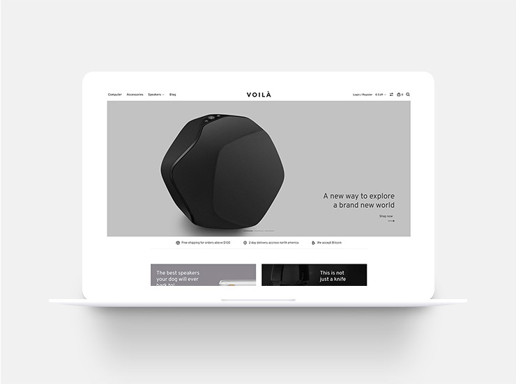
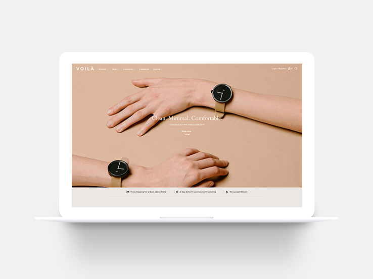
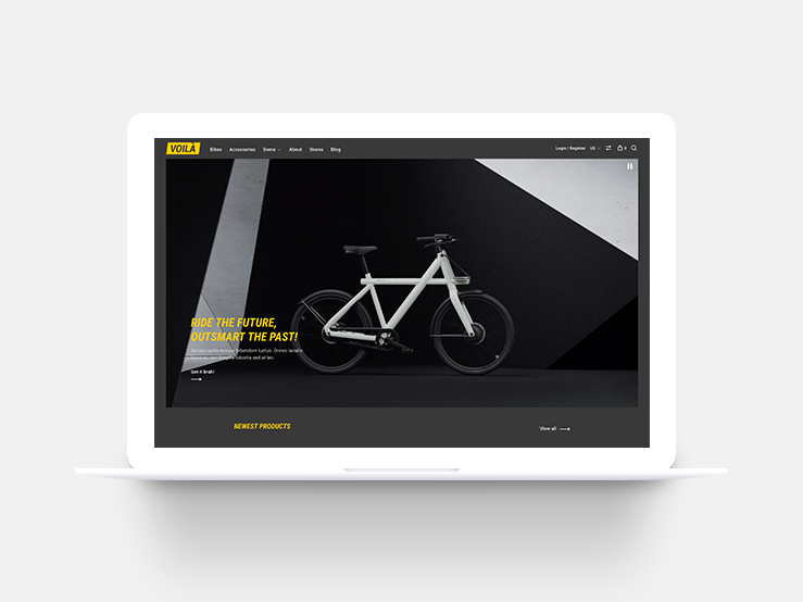
To install a specific preset, go to Design > Customize theme > Install preset.
Customization #back to top
To start customizing your theme, go to Design > Theme editor. On this screen, click on the blue button labeled "Theme settings". DO NOT click on "Theme editor". This is for advanced custom theme development only and you will no longer receive any updates. Read the sections below to learn more about each options.
If you require custom theme development services, please contact me on this page.Logo #back to top
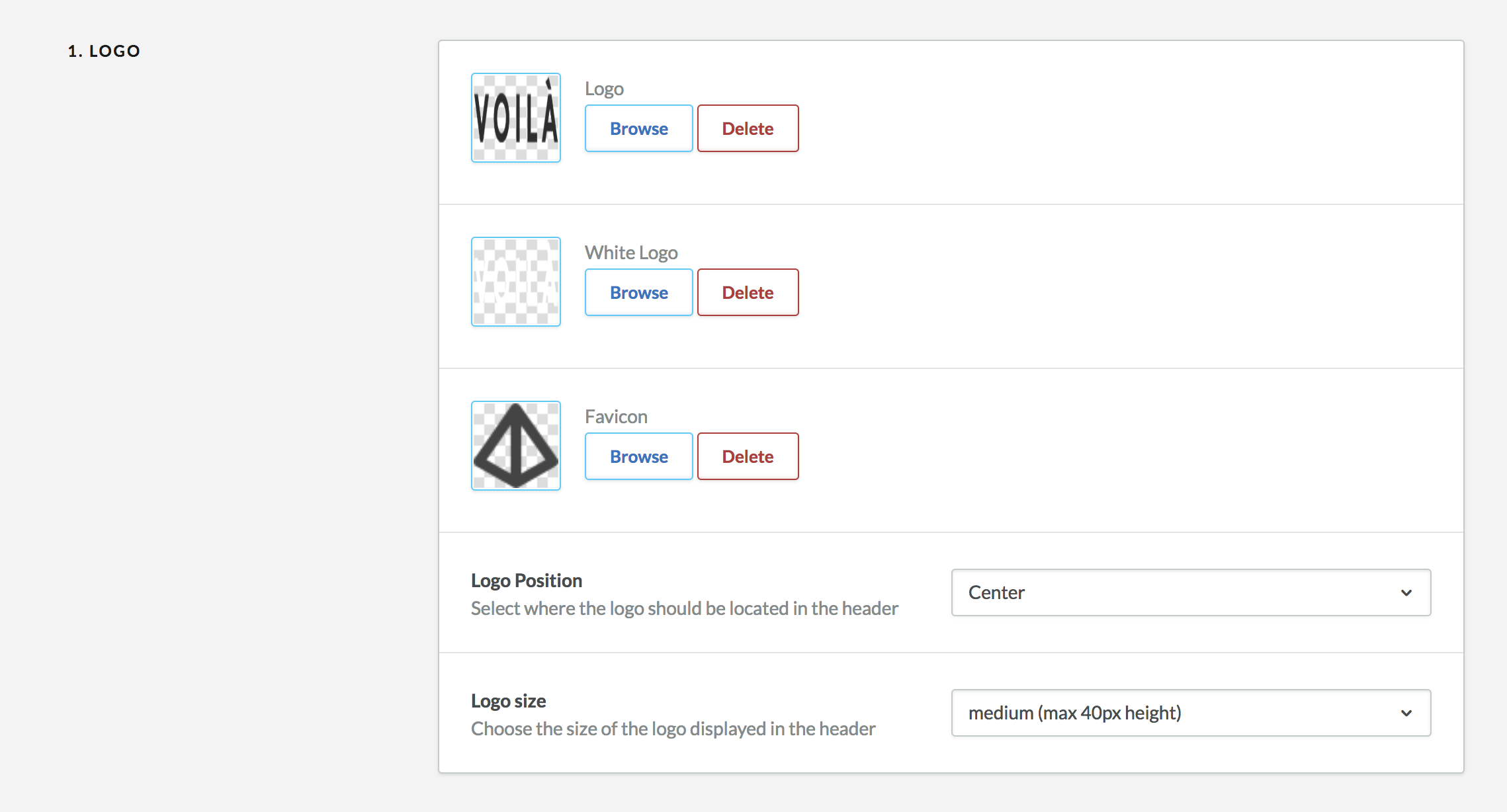
Upload your logo
Upload the main logo for the site in the logo field. We recomment uploading a logo that has twice the size of the desired result. This will allow HD screen to display a crisp logo. We also recommend to upload a .PNG image with a tranparent background. JPG images do not allow transparent background and may look weird on a colored background or over the full width hero banner if enabled.
You can also upload a white version of your logo. This is an optional feature and will only be needed if you're planning to use the Full width hero banner. When using this banner, an image will be placed under the logo and you can choose to display the white version when the background is dark to make sure there is enough contrast to be visible.
Logo position
Please select where the logo should be placed in the header. By default, it will be displayed to the left before the menu, but you can also center your logo in the middle of the screen.
Left logo

Centered logo

Logo size
We predefined 3 sizes for your logo to make sure it looks good in the header. Pick the one that fits your desired result.
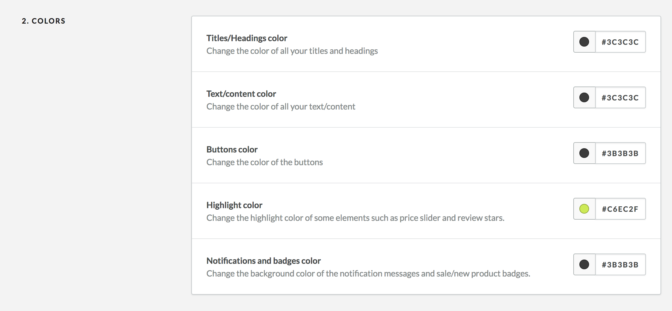
Colors #back to top
You can customize Voilà's elements colors in this section. This will allow you to give a unique look to your store. We recommend you leave enough contrast between the text and the background at all times to make sure the content is readable. Here are the colors you can customize:
- Titles/Headings color: This will change all the main titles and headings color of the site.
- Text/content color: This will change the main text and paragraphs color on the site as well as some input elements.
- Buttons color: This is mainly used for the add to cart button on product pages.
- Highlight color: This color is only used for some small elements such as the price picker and review stars.
- Notifications and badges color: This will change the background color of the "Sale" and "New" product badges and also the notifications that may appear on the pages. Keep in mind that the text inside these notification is white so it must be dark enough to be readable.
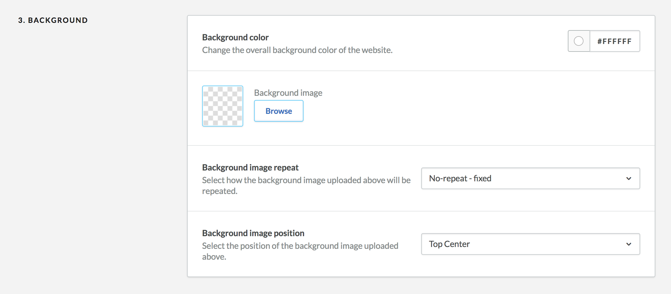
Background #back to top
You can customize the background of your store by changing its color and by adding a background image. We recommend only changing the background color.
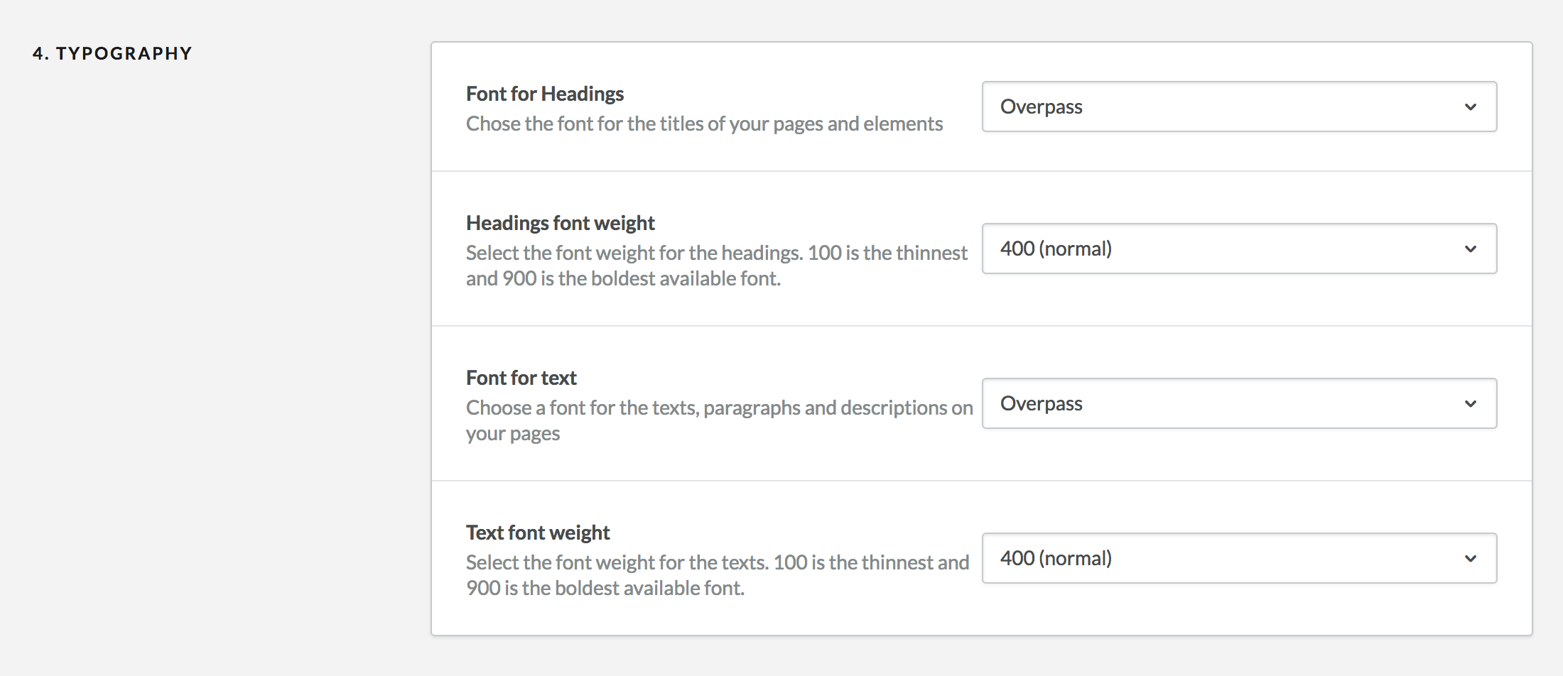
Typography #back to top
You can customize the typography of your online store using this section. You can pick from a variety of Google Fonts. To preview each font, you can either serch it on the Google Font website, or try to enable it to see the result. You can pick two different fonts for the headings/titles and the main body text of your store.
You can also pick the font weight for each element. Please note that some fonts may NOT have the desired weight available. If you want to know if a font weight is available, please visit Google Fonts. Otherwise it will be substituted by the closest available weight.
Header #back to top
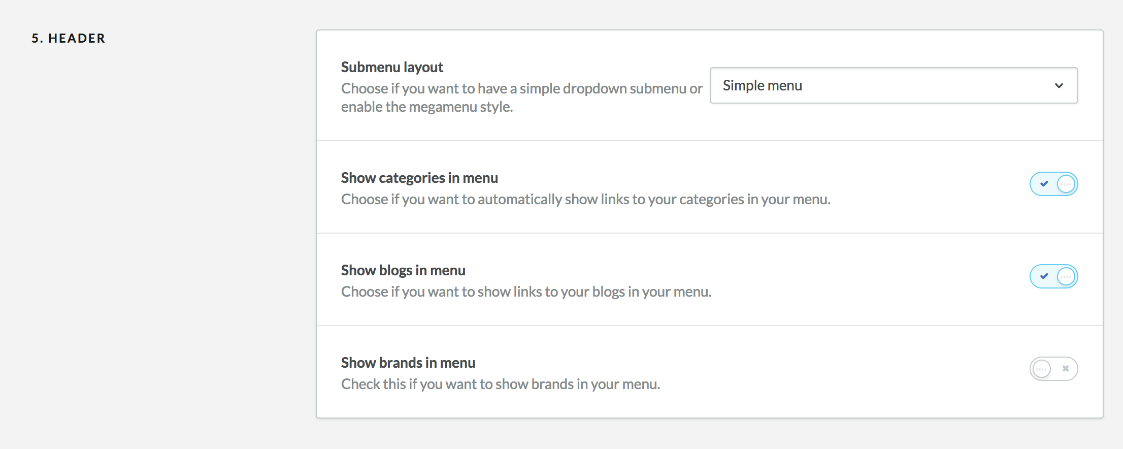
You can customize the header/menu layout of your online store using this section. There are a few menu layout options:
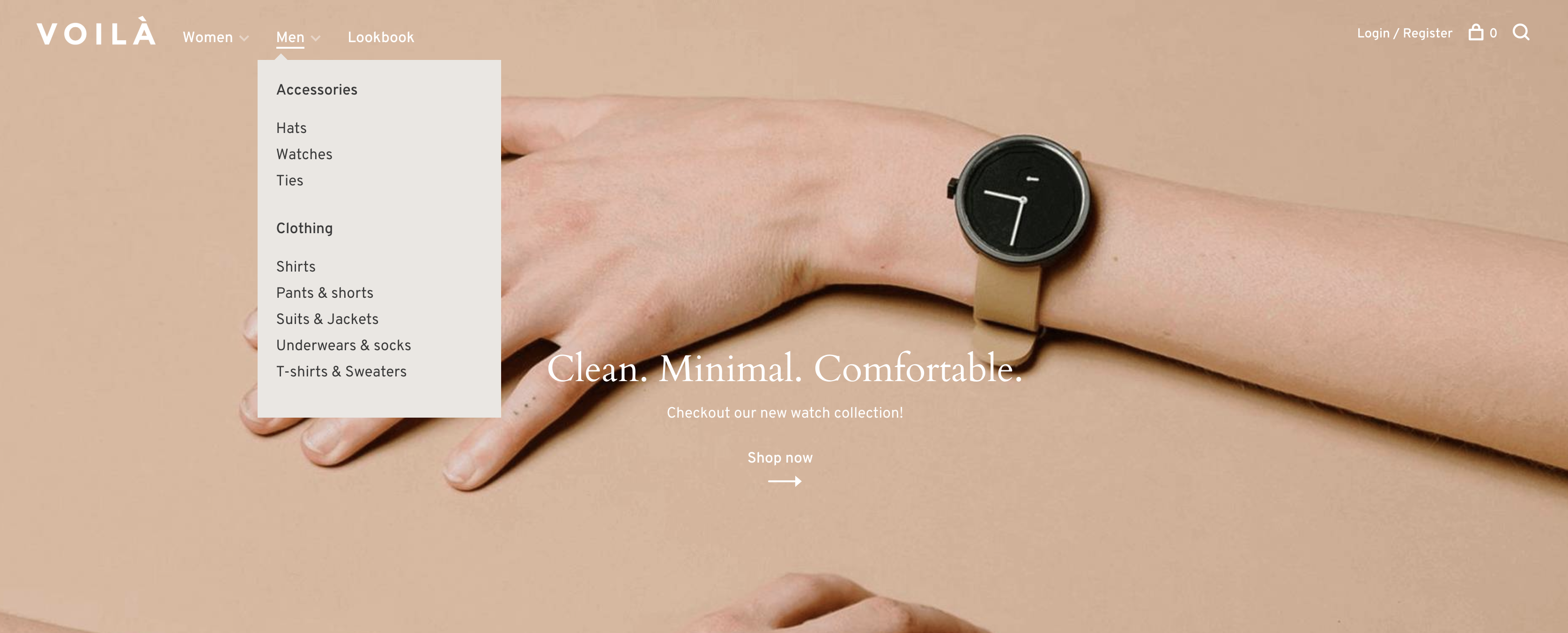
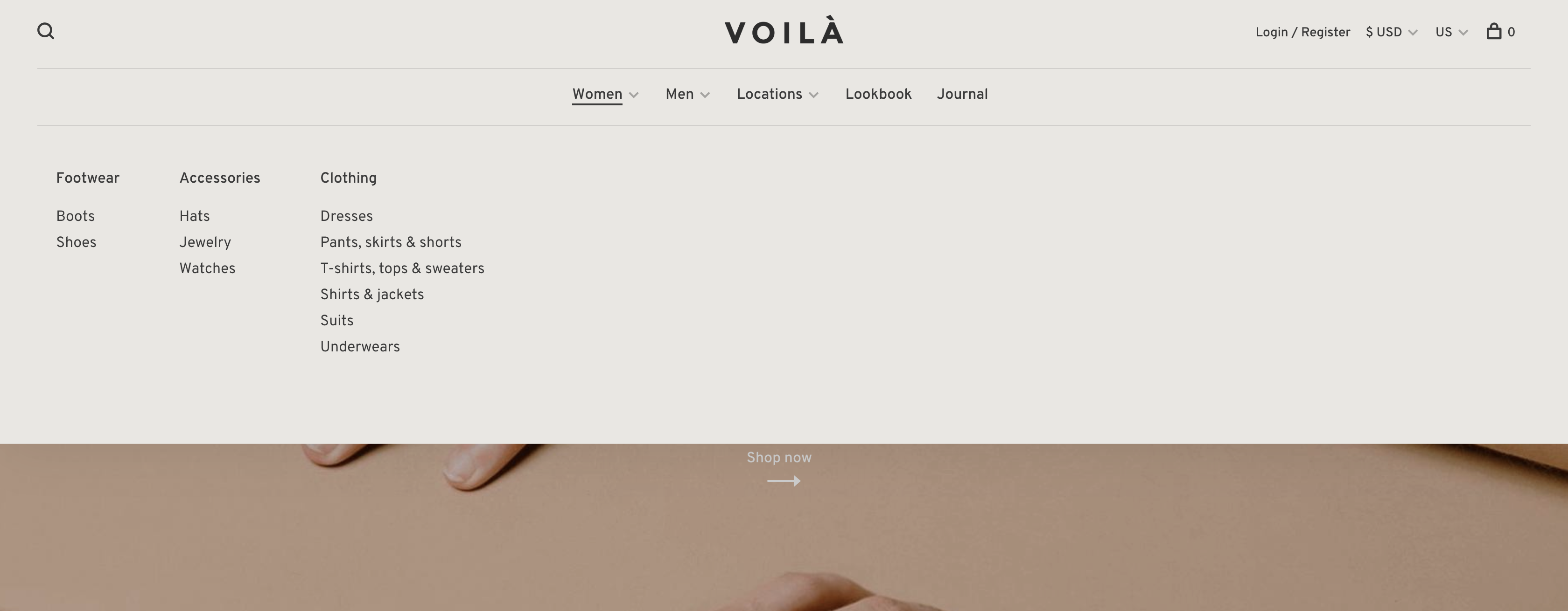
Mega menu - Menu inline
Simple menu - Menu inline
Menu below the logo - Logo center
Menu below the logo - Logo left
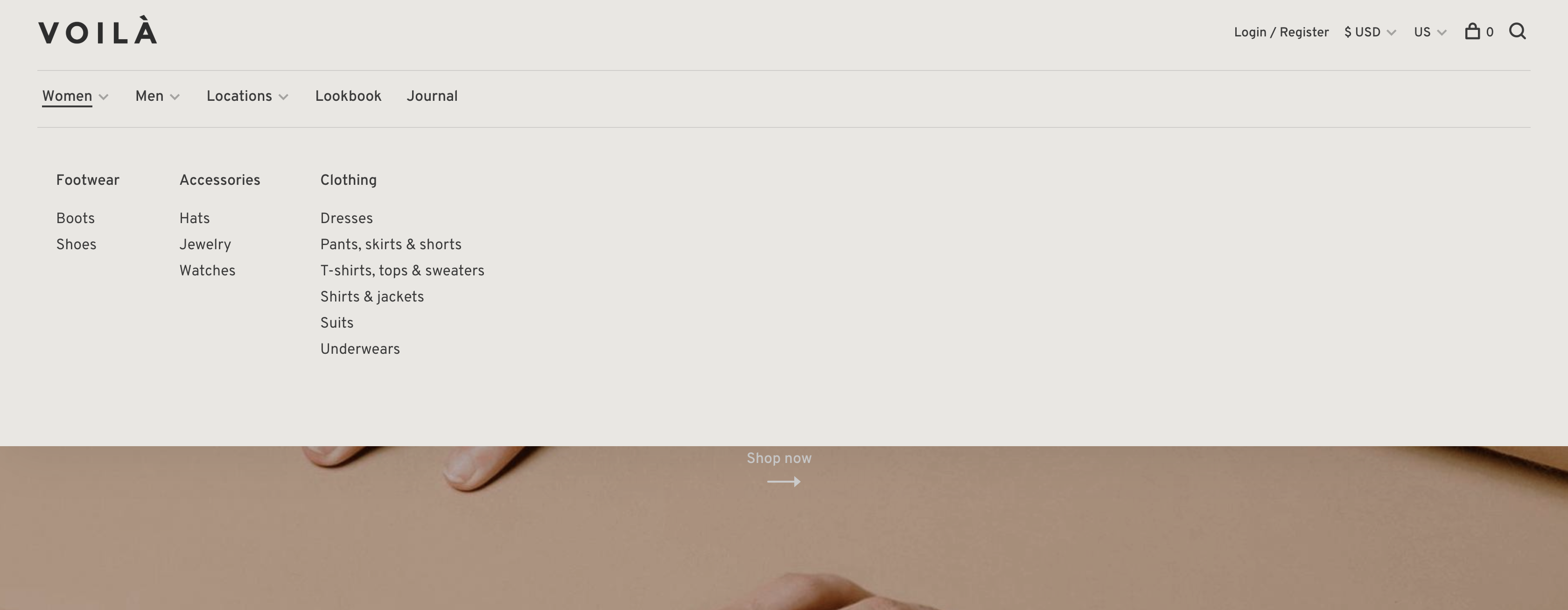
By default, your product categories will be shown in the menu up to 3 levels. Children of a parent category will be displayed in a submenu. You can disable this feature and manually add links in your menu by visiting Design > Navigation.
You can additionally choose to display a link to the brand page that displays all the available brands of your site and a link to your enabled blogs under Blogs > Blogs.
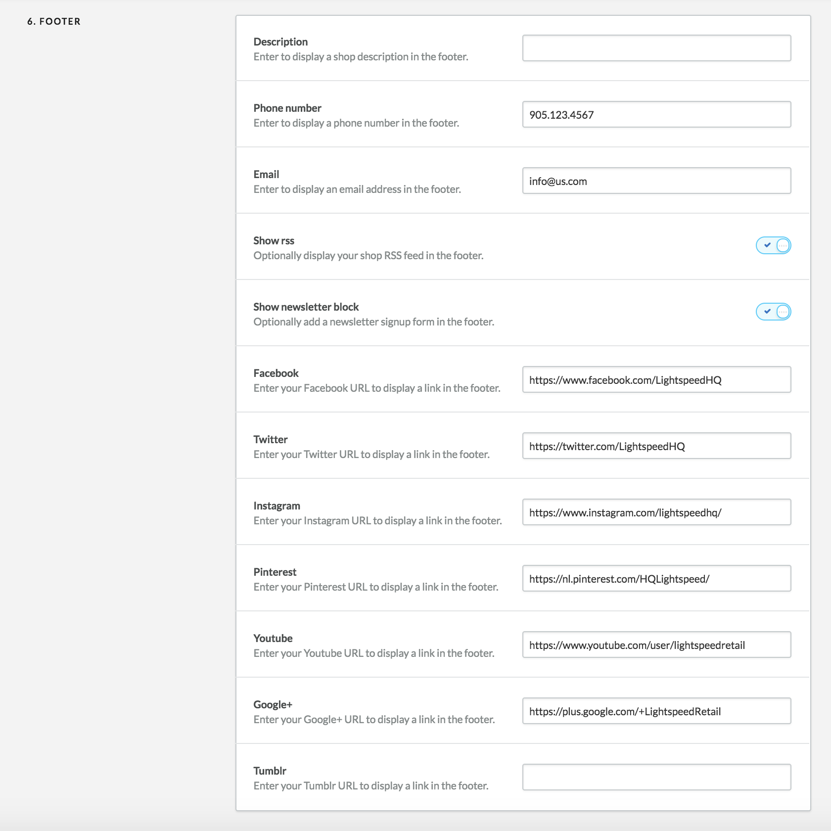
Footer #back to top
You can customize the footer of your online store using this section. The options are straight forward so you can fill them according to your needs.
Home modules #back to top
Voilà comes with a module system that allows you to customize your homepage as you wish. You can select which modules you want to display and in which order. You will find more information on each modules's settings below.
To display the modules, select an item in each of the module's slots of this section. You can also select "empty" if you do not want to display anything in a slot. Please note that some module specific settings may prevent a module from displaying. Read carefully this section to make sure everything gets displayed as you wish.

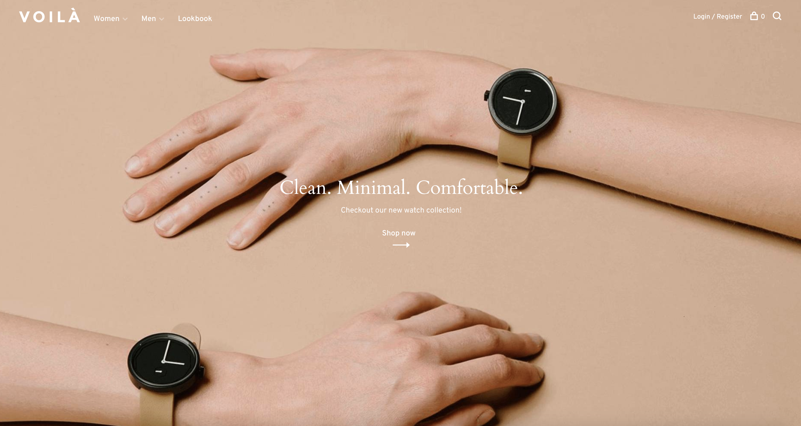
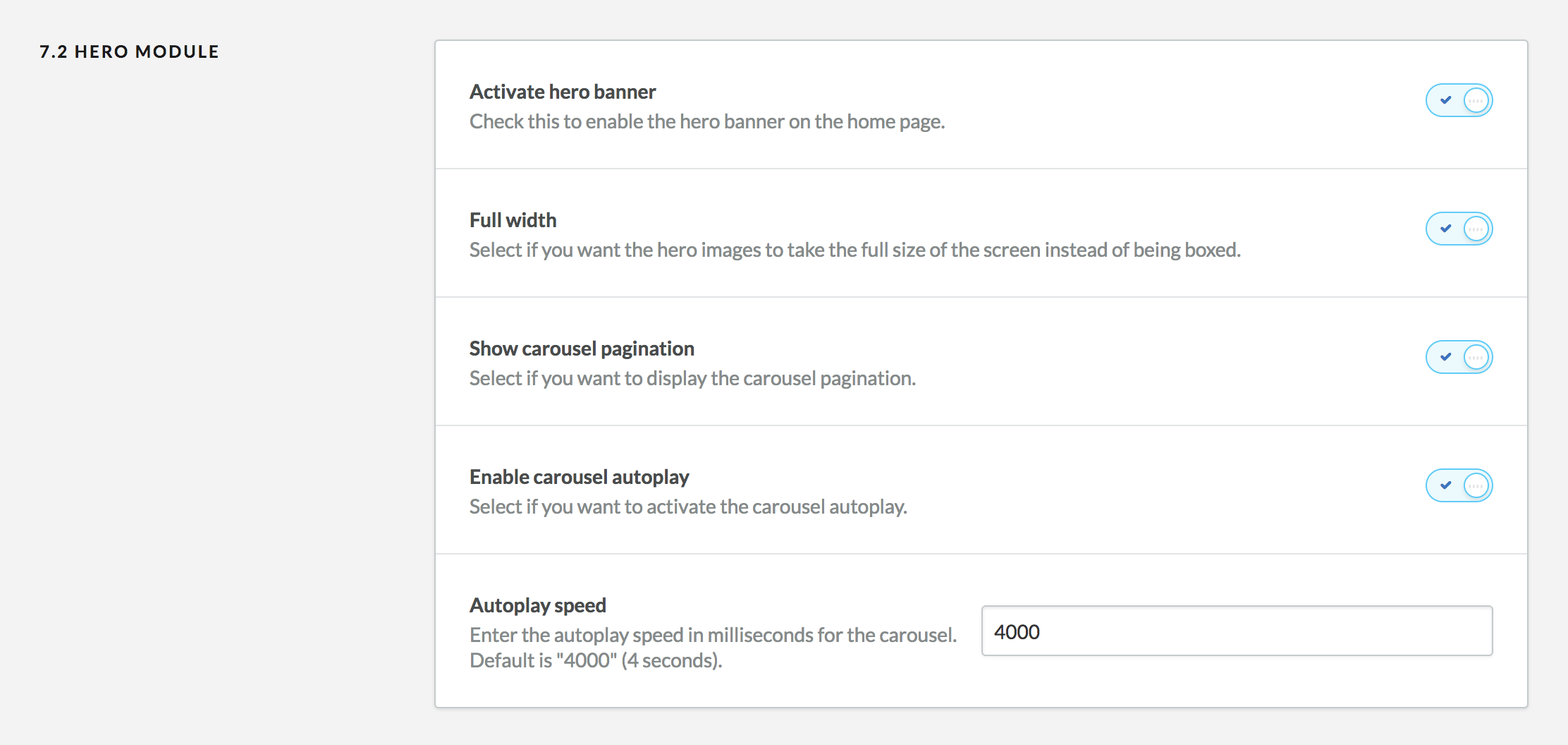
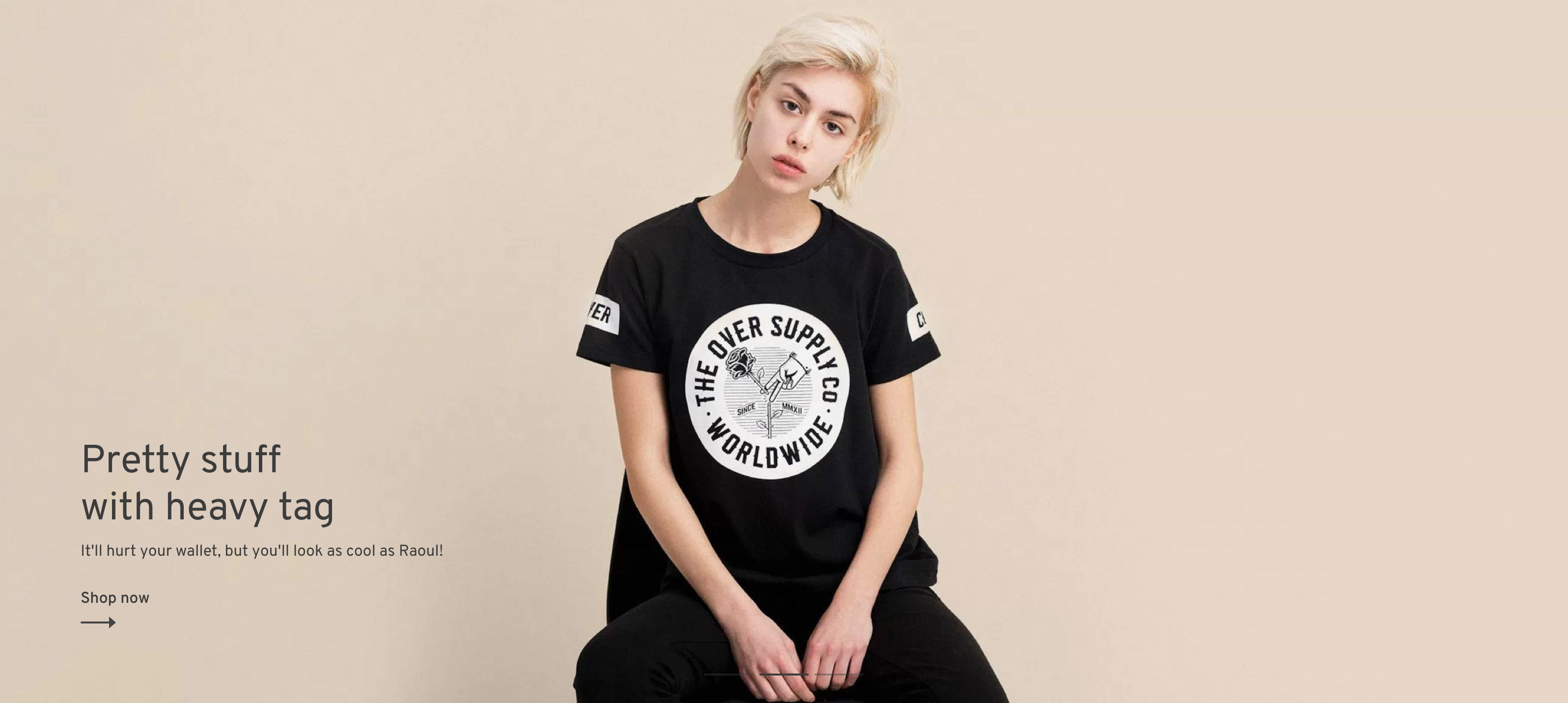
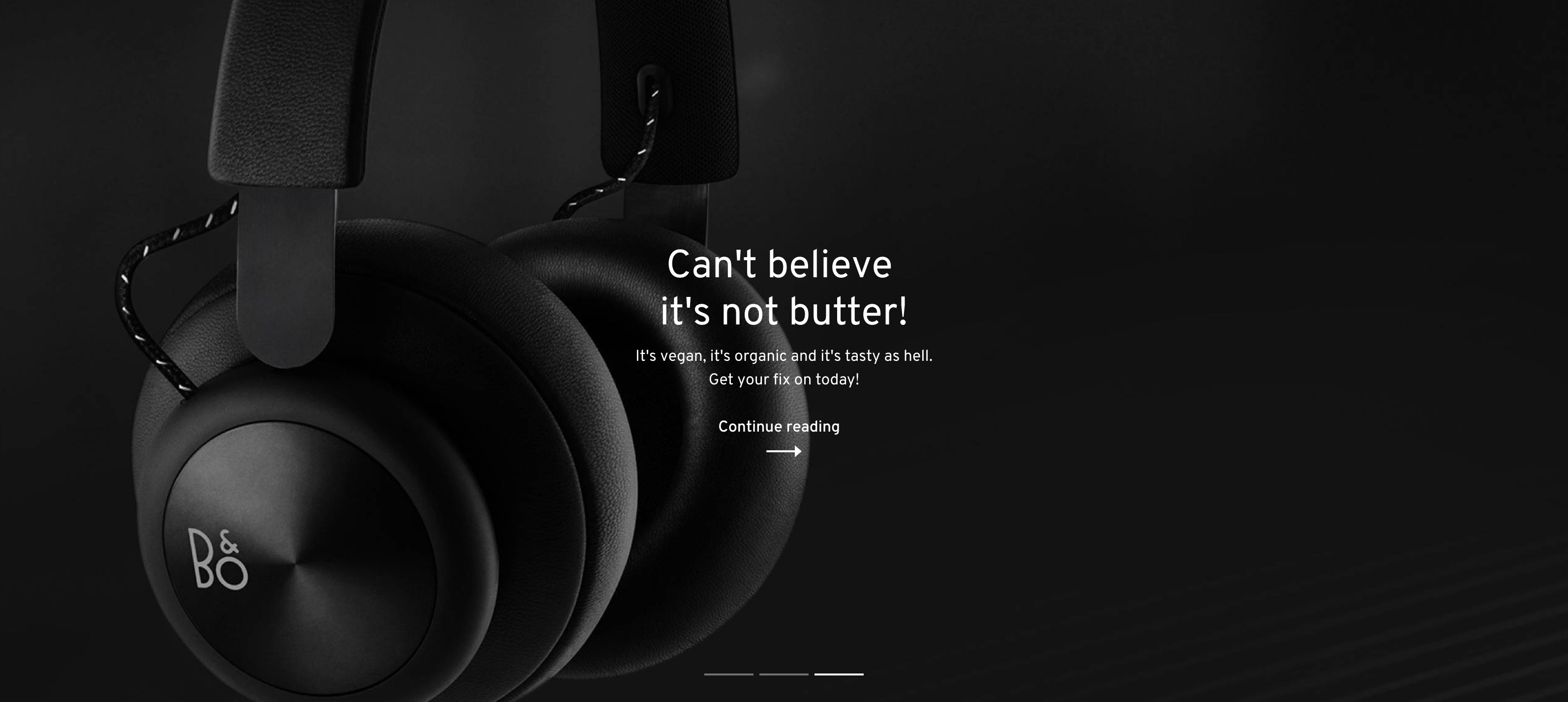
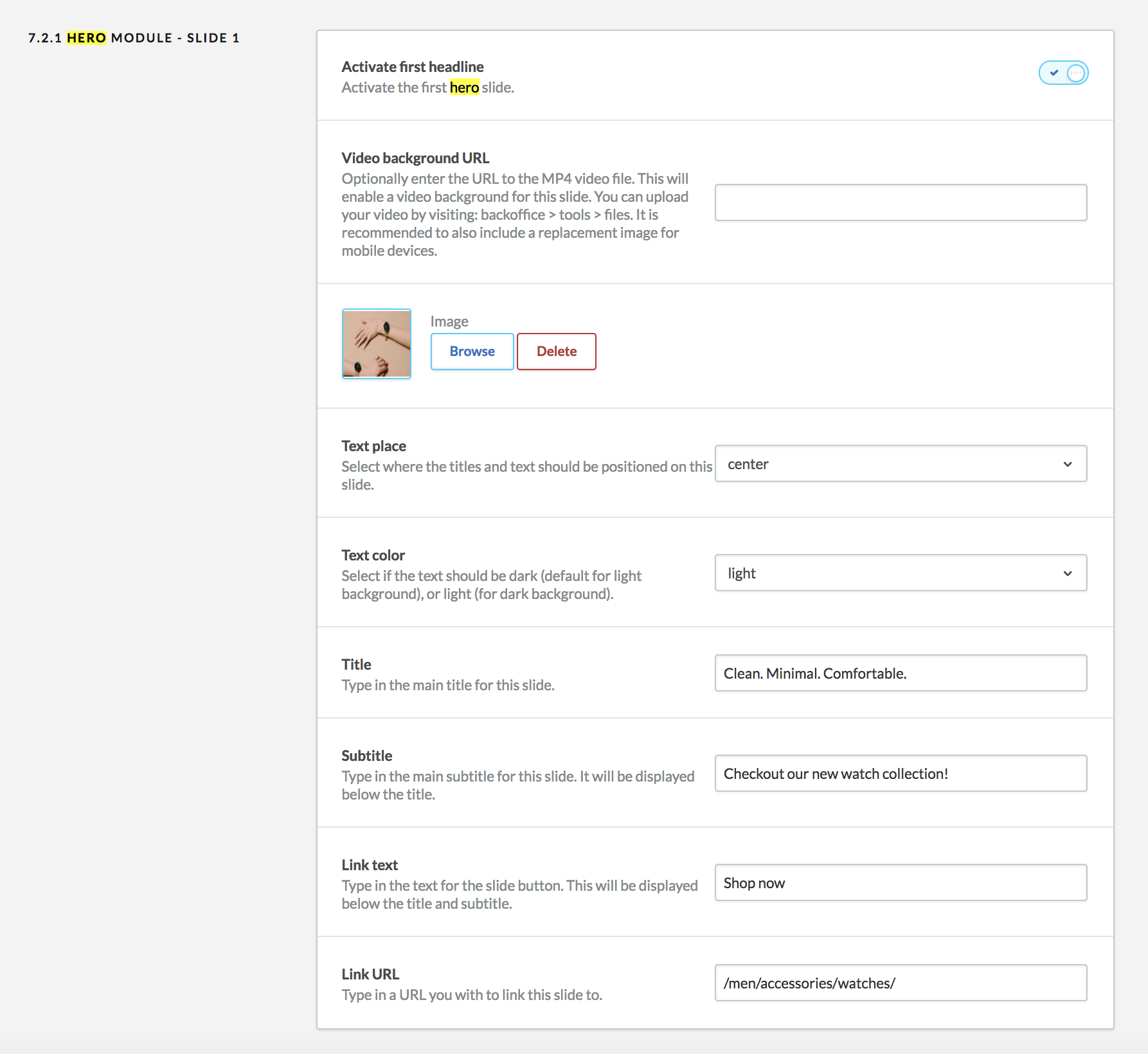
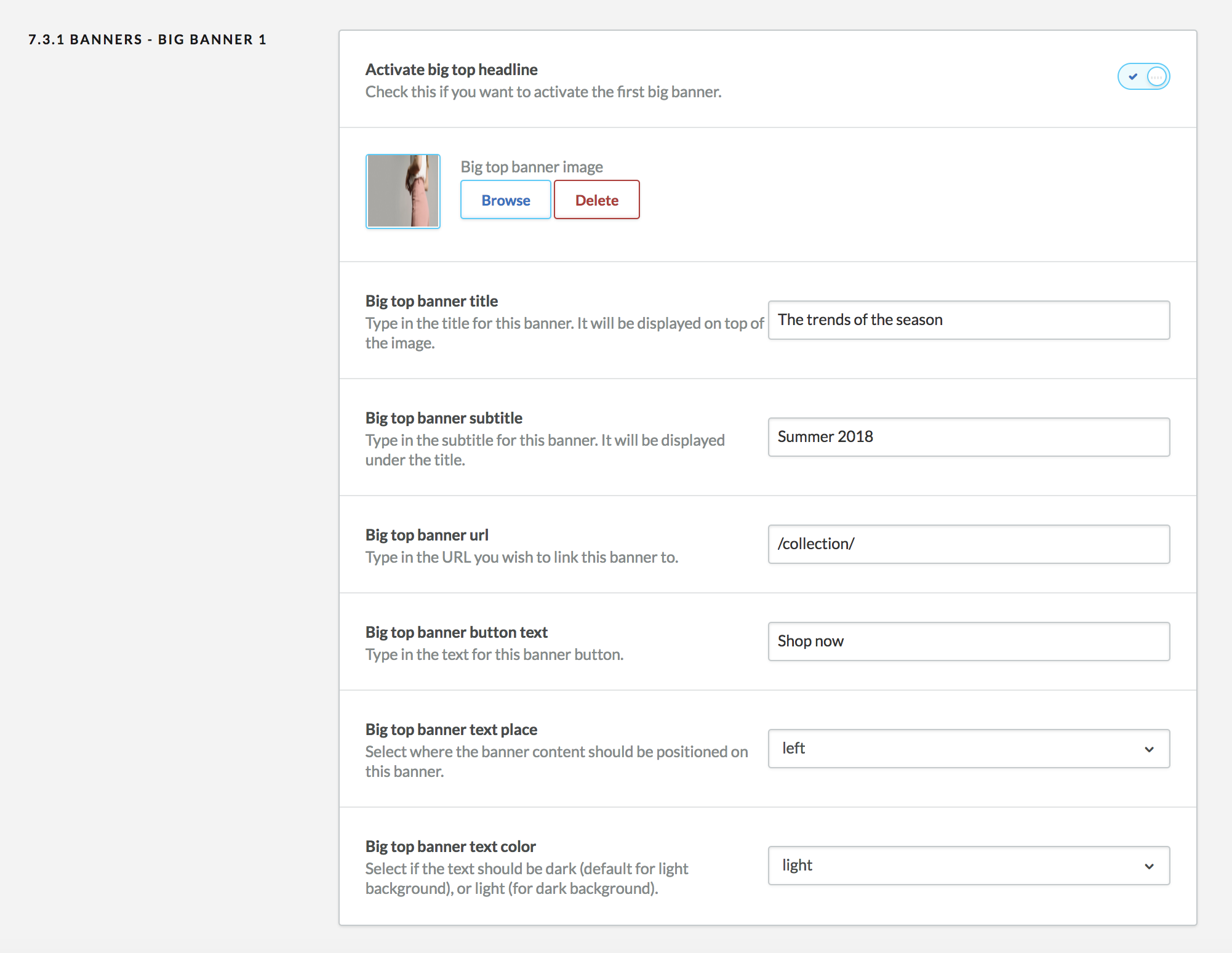
Hero banner - #back to top
This is the main hero banner for your store. The hero banner module allows you to display big bold introduction images, carousel or even video to welcome your customers.
There are 2 types of layout for the hero banner: Boxed and full width. Both options allow you to use simple images, video or carousel.
Boxed
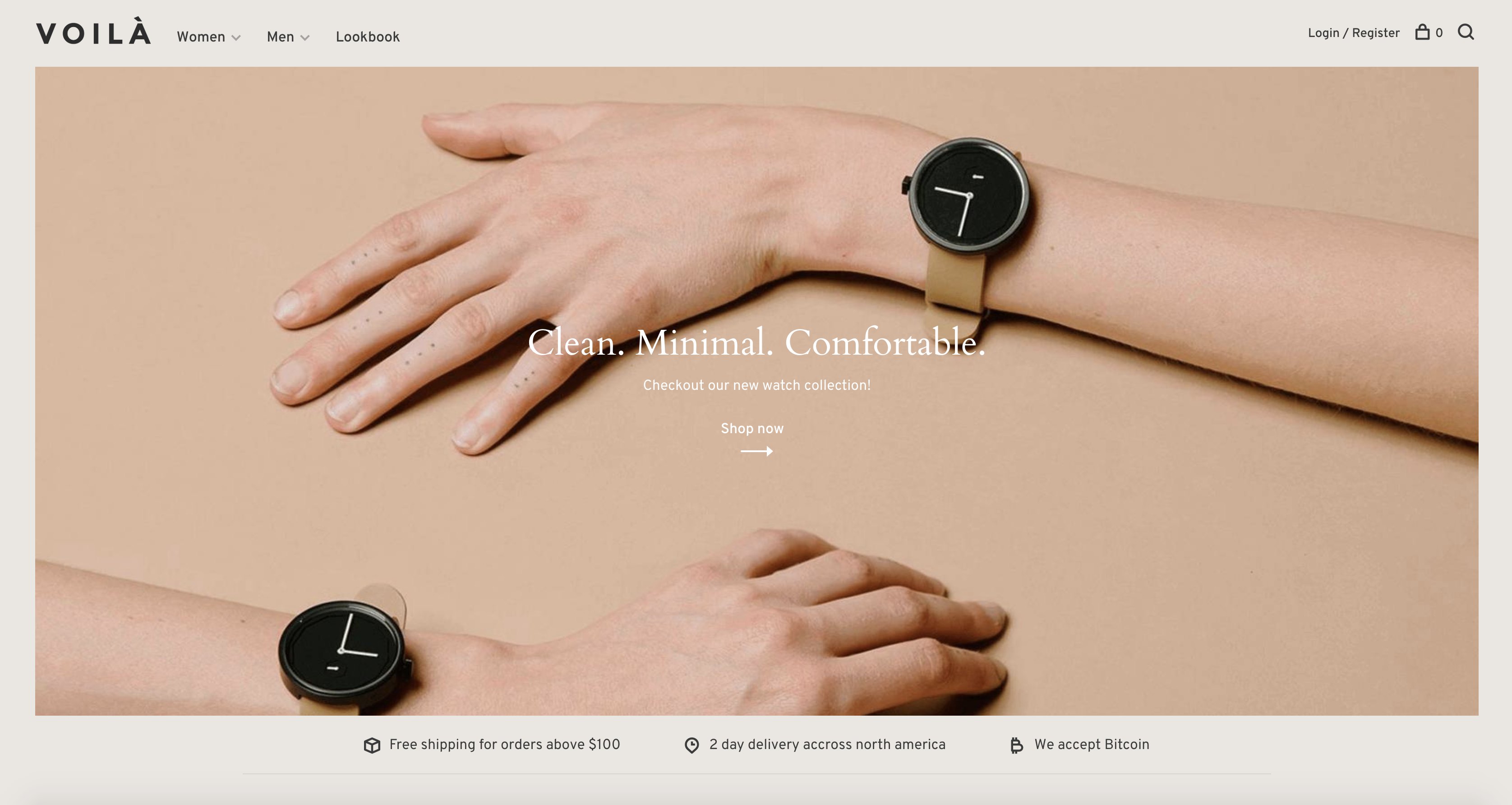
Full width
Please note that if you want to use the Full Width feature, you must upload a white logo as described in the Logo section. Uploading the white version of your logo will ensure you have enough contrast between dark background images behind the logo and the logo itself. The white logo will only be displayed when you set the slide text color to white. If you have more than one slide, the menu color and logo will change according to the option you selected for each slide.
You can also pick if you want to display a carousel pagination (if you have more than 1 slide), and set the autoplay feature as well as its speed.
Hero banner slides
You can add up to 3 carousel slides and each slide has its own set of options you can customize. If you only want to display a single image or a video, only fill out and activate the first slide.
You can only have one video video background in the carousel for performance and usability reasons. This is why only the first slide has the option to add one. It is recommended you only use a single slide when using a video background.
To include a video background, go to backoffice > tools > files and upload the .MP4 video you wish to use. The sound will be automatically turned off and the video will automatically loop for a better user experience. It is recommended you upload a short and small video with a resolution of 720p or 1080p. The smaller file size the better.
There are 3 text place options:
Left
Center
Right
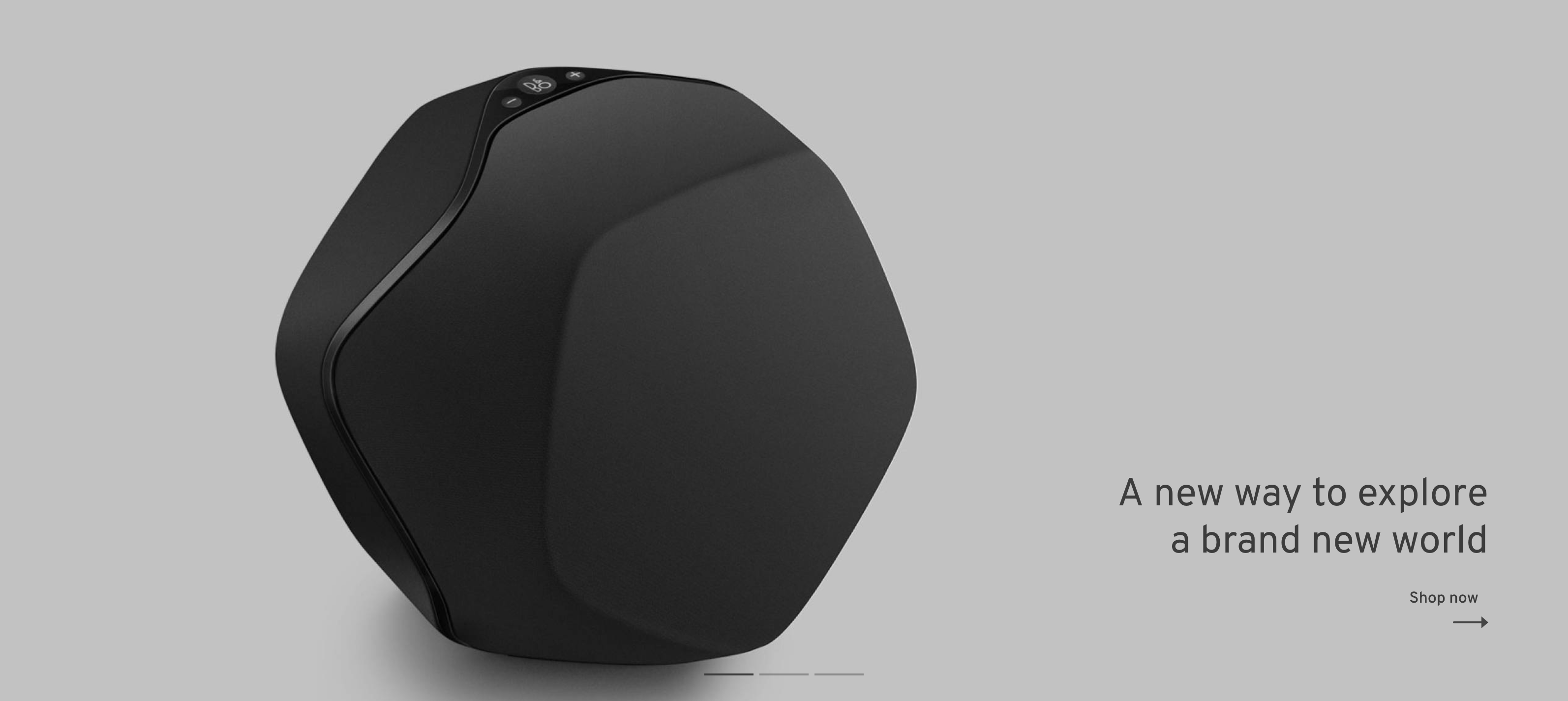
Pick the one that fits your image the best. You can also add a title, subtitle, button and a URL to link this page to.
The text color option is important here. Pick the one that has the most contrast with the background image. We want to make sure the text is readable at all times.
CTA banner blocks - #back to top
This module will display call to action blocks with a background image, text and a link. It is ideal to promote sales, categories or any content you want to put up front. You can add up to 3 blocks: A big, full width block and 2 smaller blocks that will take half the content width. Each blocks have similar options.
You can pick up to 3 positions for the text on that block. Pick the one that fits the best
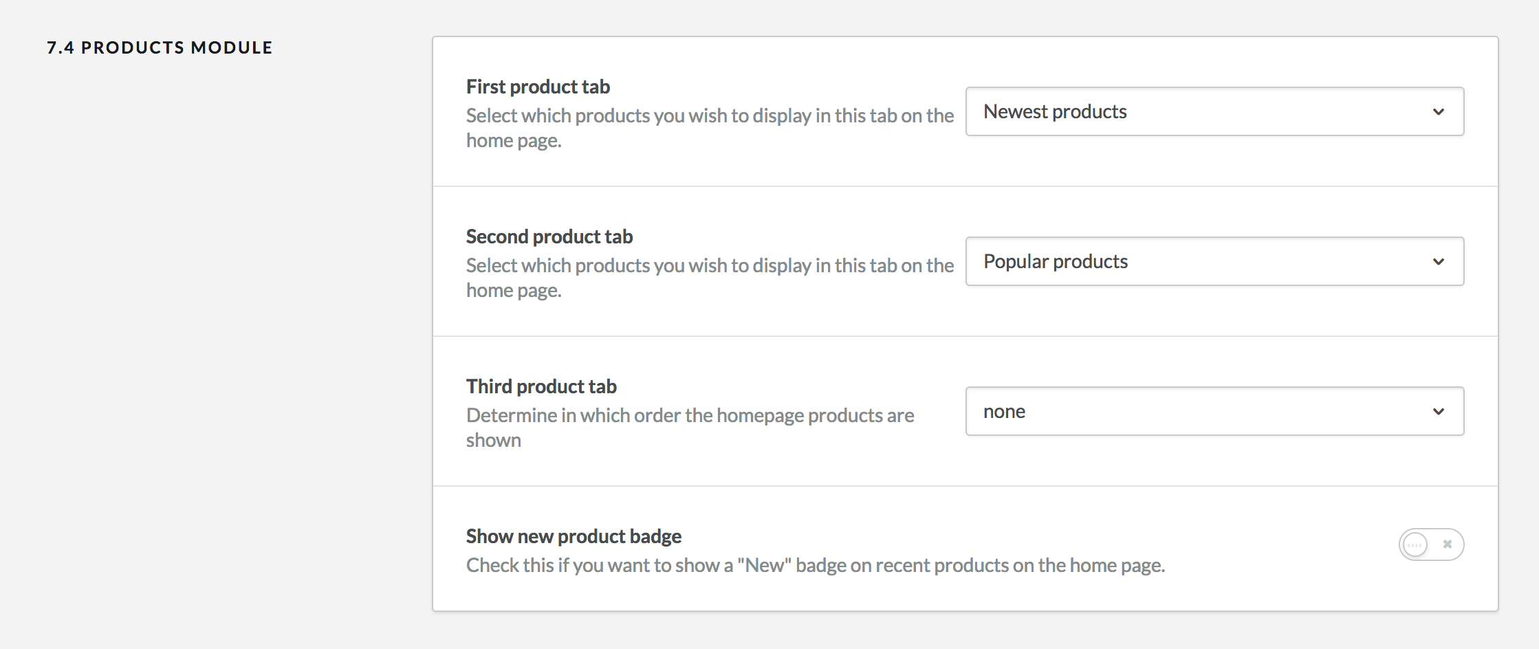
Products - #back to top
This module will display one or multiple list of products. You can filter products by popularity, newest or featured. If you only want to a single product list, simply select "none" in the second and third product tab.
You can also select if you want to display a "New" badge on top of all the products in the recent product feed.
Blog - #back to top
This module will display the 3 most recent article from your blog. There are currently no options for this module.
Brands - #back to top
This module will display a list of your shop's brands. There are no options for this module.
Categories - #back to top
This module will display a list of your shop's featured categories. The amount of columns will depend on how many featured categories you have set in your shop. We recommend having a maximum of 5 or 6 featured categories.
To set featured categories, go to backoffice > design > featured categories and click on "Add category". Make sure to upload an image while editing the featured category. This image will be displayed as a background behind white text, so make sure there is enough contrast.
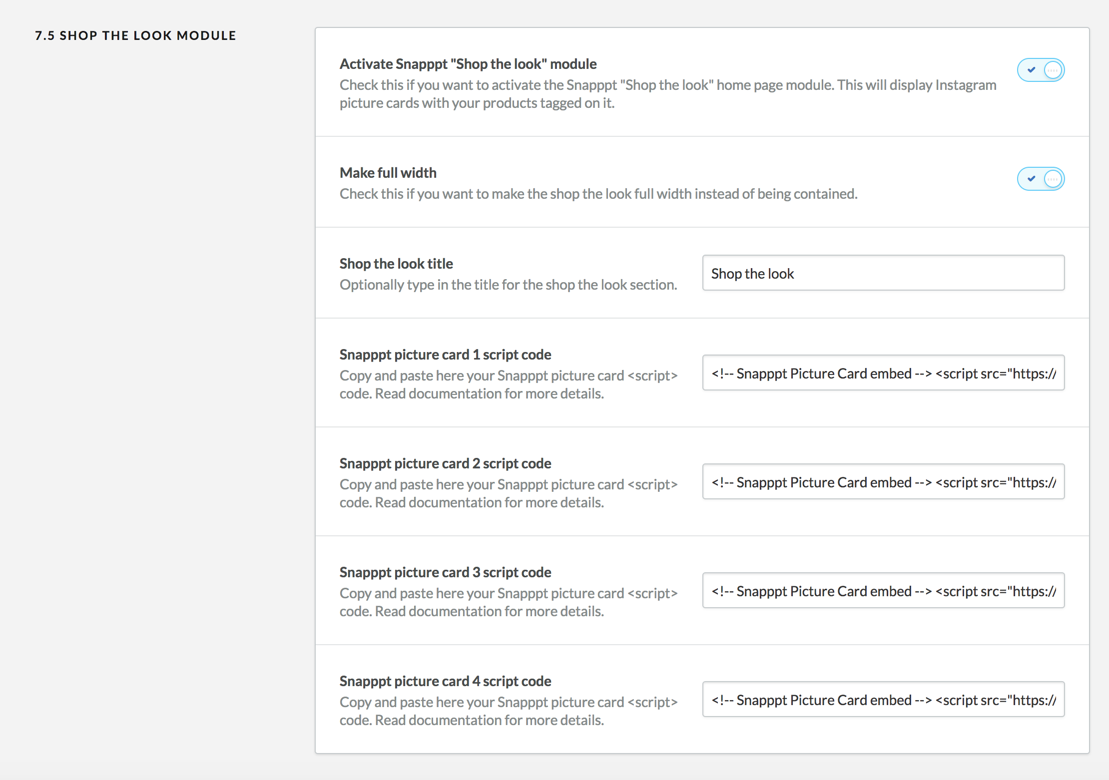
Shop the look - #back to top
This module will display a list of your shop's instagram photos with products tagged on top of them using a third party service called Snapppt. Please not that the Shop the look features currently doesn't work in Internet Explorer 11. Snapppt is currently working on IE11 support.
To get started, visit https://www.getsnapppt.com/ and create an account. You will need to connect this account to your instagram page.
Go to your instagram feed, and select a photo you would like to add to your home page. Fill in the options by adding your products on top of the photo.
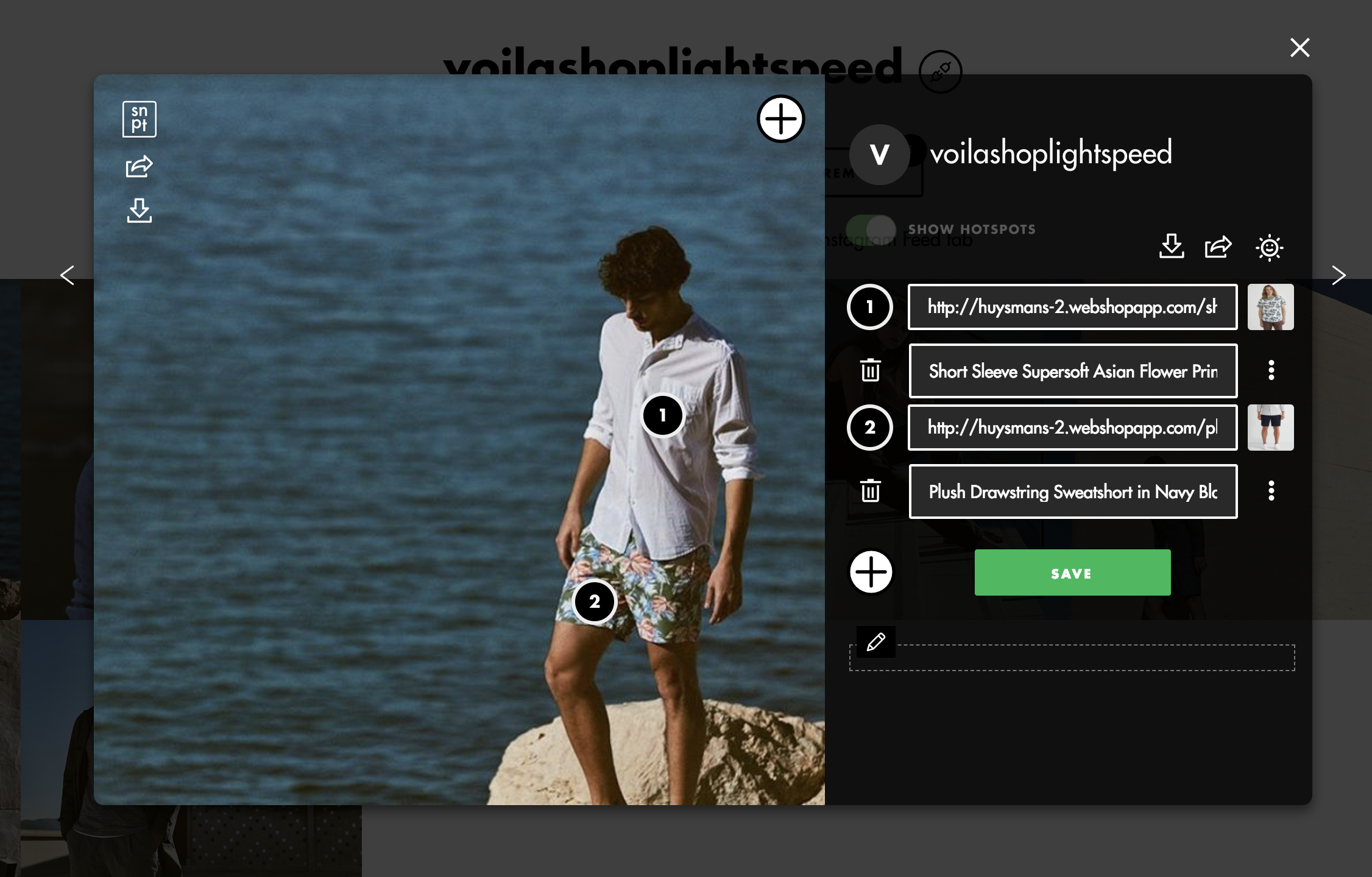
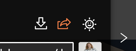
Click on the share button of this popup window as seen in this image:
Select the style you would like to have for this picture card and copy the embed code at the bottom.
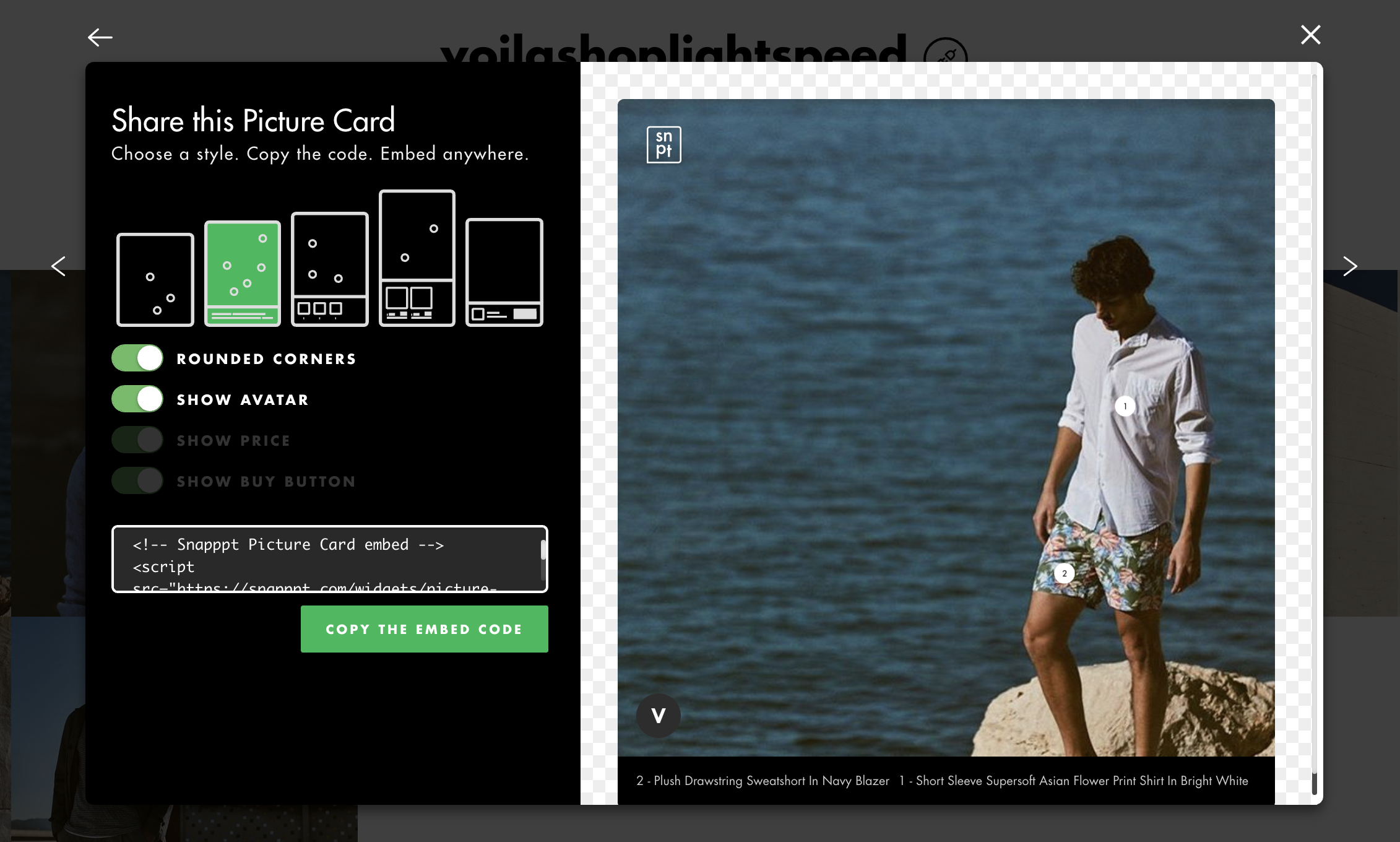
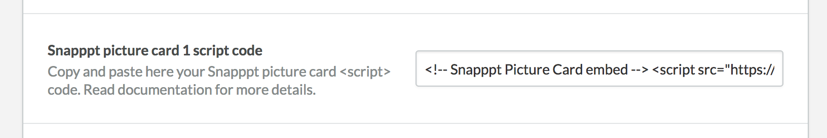
Paste the code in one of the "Snapppt picture card script" fields in the theme editor
You change the title of the section and select between a full width layout (from the left side of the window to the right) or a contained width (same width as the rest of the content).
Instagram feed - #back to top
⚠️ Update November 25th, 2020. The previous method to display your Instagram feed was blocked by Instagram and doesn't seem to be working anymore. A new, more stable method has been provided using the required third-party https://www.instant-tokens.com/. To enable this, follow these simple steps
⚠️ Update July 20th, 2022. https://www.instant-tokens.com/, the third-party service used to enable the Instagram feed decided to turn their free service into a paid subscription. If you have setup a feed prior to this change, your Instagram feed will no longer be displayed on your shop. You can still subscribe to their paid service to enable your Instagram feed once again. In order to offer theme owners another alternative, the theme now also integrate with a new third-party provider https://behold.so/. This service has a free tier (up to 1200 views/month as of today). See this page for more pricing options. The 2 methods will be explained below:
Medod 1: https://behold.so/
This third-party service has free and paid options. See pricing details here https://behold.so/pricing.
- Create a free account on https://behold.so and log into your account.
- Click on “Add account” to connect your Instagram account to Behold. You can connect via the “Basic API” option.
- Click on “Add feed” and select “Widget”. You can set the options as you wish, but I recommend the following settings: Number of posts (6), Max width (None/Uncheck), Number of columns (3), Column gap (15), Row gap (15).
- Copy your embed code and paste it into your theme settings. Make sure to select Behold.so as the third-party provider for this module.
Medod 2: https://www.instant-tokens.com/
This is a paid third-party service. See pricing details here https://www.instant-tokens.com/pricing.
- Create a free account on https://www.instant-tokens.com/ and click on Authorize an Instagram Application. It will prompt you with a window on which you need to authorize the service by logging in with the Instagram account you wish to use.
- Once the application connected, and visible in the list of applications, click on JSON response in the Instant Token API endpoint column. Copy the URL provided.
- Paste the URL under Design > Edit theme > Page: Home page > Module – Instagram feed.
Home page content - #back to top
This module will display the content of your home page. To edit the content of your page, go to backoffice > pages > home page and add in the text/HTML you want. There are no options for this module.
Please note that you can use the bootstrap grid system in the pages.
Tag list - #back to top
This module will display a list of the shop's tags. There are no options for this module.
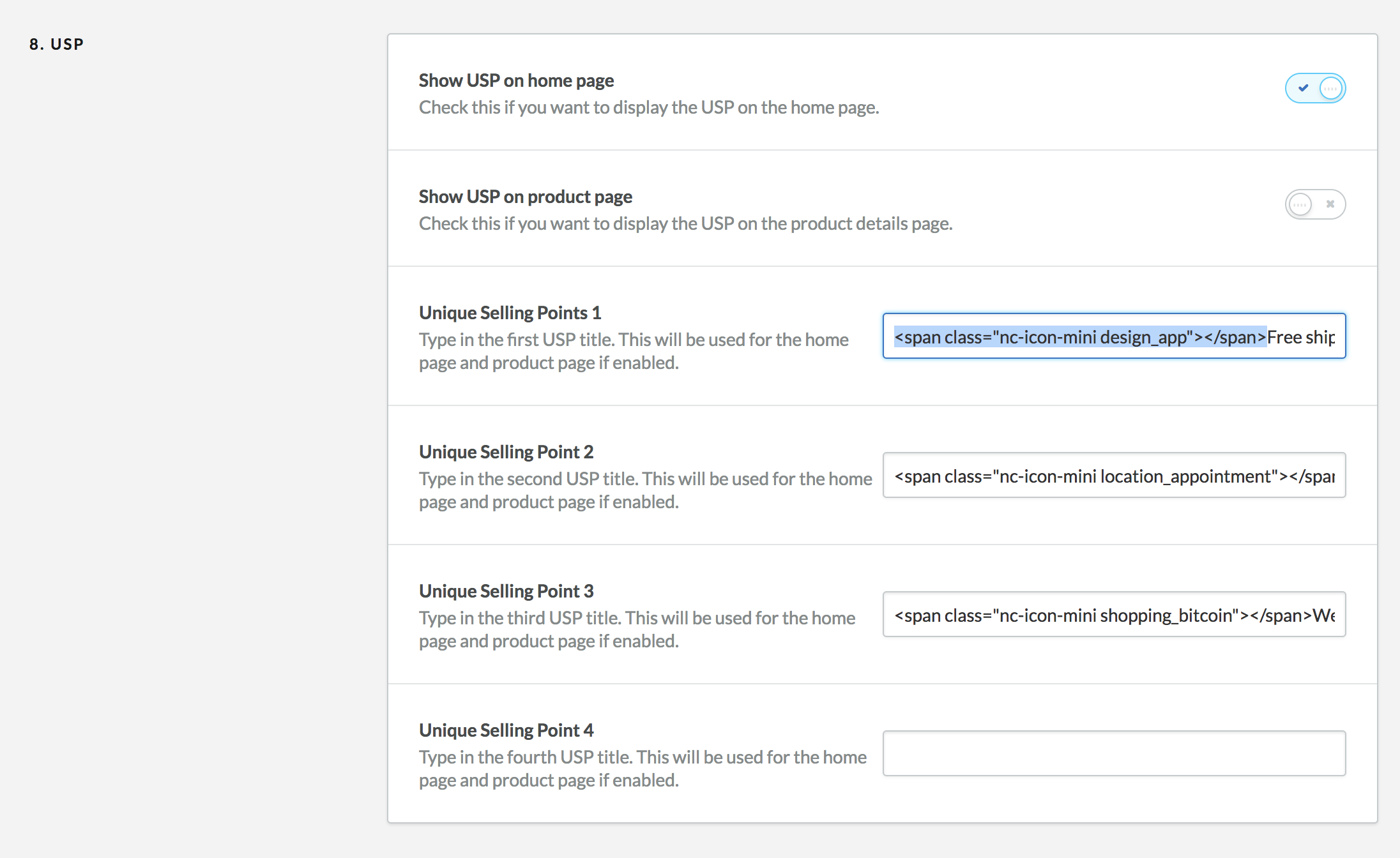
USP #back to top
You can add up to four unique selling points to your home page or product page. If you would like to add an icon, you can add the following code snippet before your USP name. In the following case, replace "design_app" by any of the icons you can find on this page
Shop #back to top
In this setting section, you will find a variety of options to customize your shop's appearance. Please read carefully each option details before modifying them. You will find below more information about how to change the product page layout, product variant picker and size guides
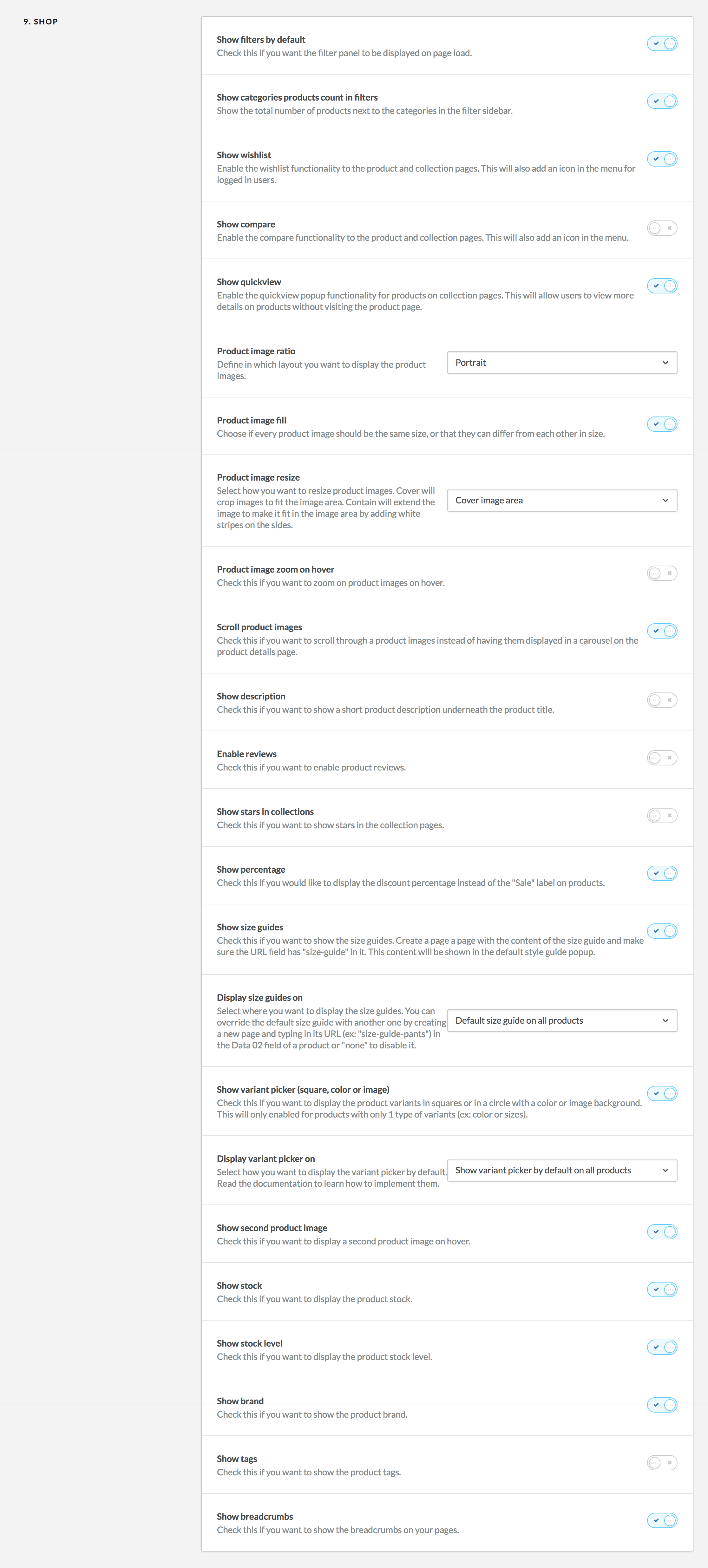
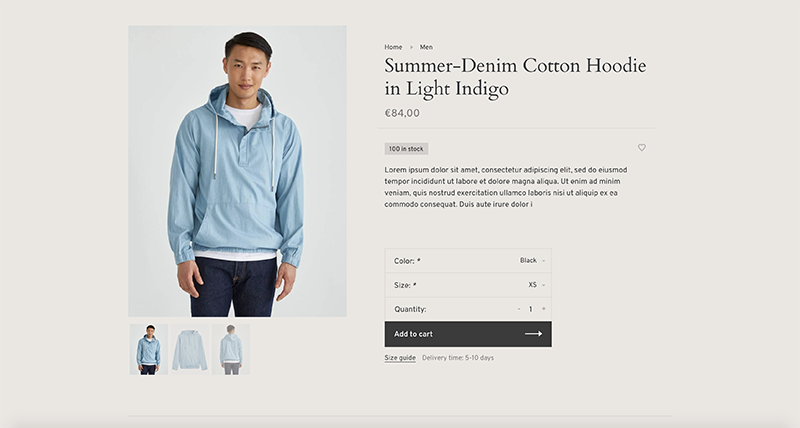
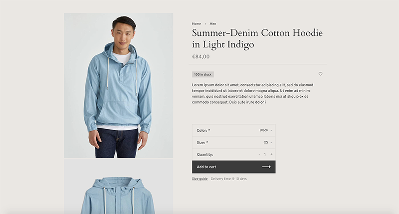
Product page layout - #back to top
You can pick between 2 product pages layout in your theme setting under "Scroll product images". If you enable this, the product images will be displayed one after the other instead of being in an image carousel.
Image carousel (default)
Scroll product images
Product variants - #back to top
If you use product variants in your shop, you can optionally decide to display the variants in 3 different ways. Please note that these optinal variant options will only be displayed if a product has a single variant type (ex: color). If your product has more than 1 (ex: Size + Color), the default variant dropdown will be displayed.
Default

Squares

Coloured circle

Image circle

-
To get started, enable the "Show variant picker (square, color or image)" theme option.
-
Then select if you want to show the custom variant picker on all products by default, or if you want enable it for certain products only.
-
Show variant picker by default on all products
If you select this option, the square variant picker will be displayed by default on ALL products as long as there is not more than 1 type of product variant. If you want to disable the variant picker for a specific product, type in "disabled" in the Data 03 field of the product. To enable the Data 01, Data 02 and Data 03 field, please visit backoffice > Settings > Workflow and enable "custom template data" option. Once that is enabled, a new set of field will be added at the bottom of your products forms.
You can also replace the main size guide by another one by following the steps in the section below.If you want to enable the coloured circle or the image circle, please refer to the section below
-
On specific products
Select this option if you do not want to display the variant picker on all product pages by default, but want to enable it on specific products. To show the square variant picker for a specific product, type in "enabled" in the Data 03 field of the product page.
If you want to enable the coloured circle or the image circle, please refer to the section below
-
Enable the coloured circle
To enable the couloured circle, you must manually enter a comma separated list of HEX code (ex: "#de4748") with the hastag in front of each HEX code. All codes must be in the exact same order as the variants in the "INVENTORY & VARIANTS" section of your product settings. Here is an example displaying 4 couloured circle: "#164371, #616161, #e5e6ab, #ffffff".
-
Enable the image circle
To enable the image circle, you must manually enter a comma separated list of image URL extentions (ex: "/198866666/texture-metal2.jpg, /198866660/texture-metal1.jpg") with the / in front of each URL extentions. To upload an image, go to Backoffice > Tools > Files and click on "Upload files". Once the image is uploaded, copy the part of the URL that comes AFTER "https://cdn.webshopapp.com/shops/STORE_ID/files..." as seen in the image below:

We recomment uploading a small square 60px by 60px image. All URLs must be in the exact same order as the variants in the "INVENTORY & VARIANTS" section of your product settings.
-
Show variant picker by default on all products
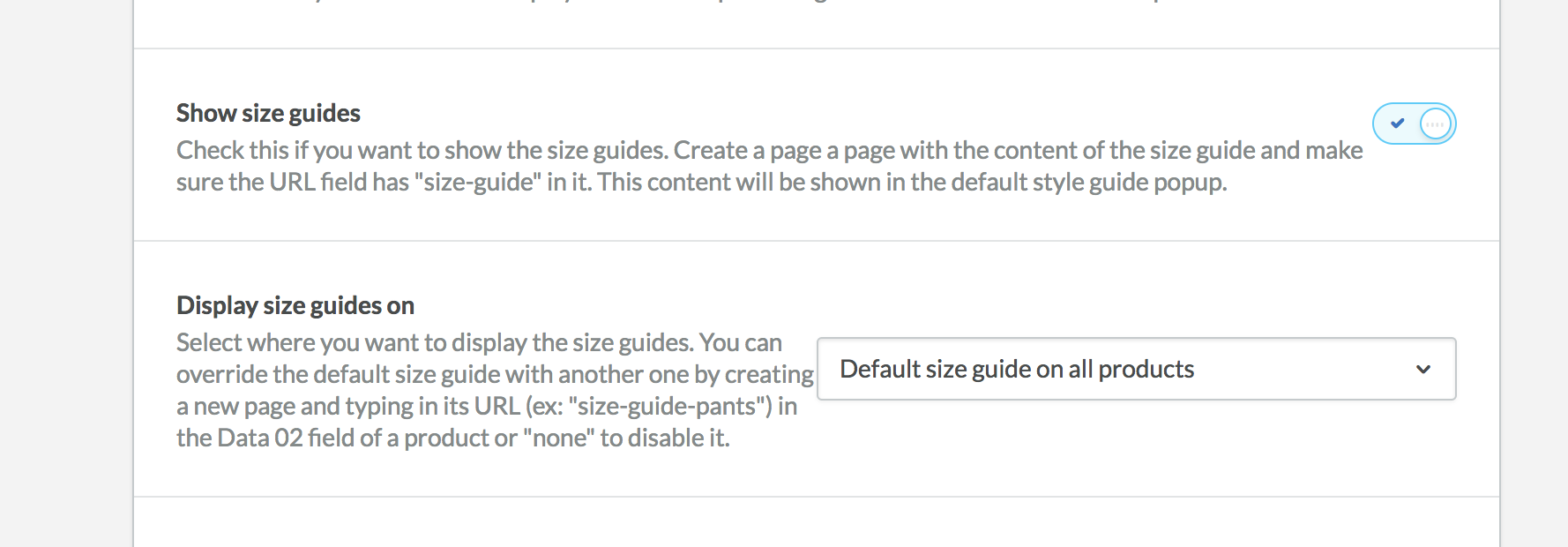
Size guides - #back to top
You can display an unlimited amount of size guides on your product pages. A link below the "Add to cart" button will be displayed and you can add any content into the size guide popup.
-
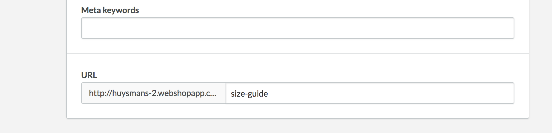
To get started, create a new page by visiting backoffice > content > pages. This will be the page with your main size guide content. You can give this page any title you want, but you must make sure the URL field has "size-guide" written in it. You can add any content you want and you can keep the visibility off (hidden) if you don't want the pages to be displayed in the footer links or menus.
If you want to use the same example as in the demo, copy the following code and paste it into the code editor of your page.
Lorem ipsum dolor sit amet, consectetur adipiscing elit, sed do eiusmod tempor incididunt ut labore et dolore magna aliqua. Ut enim ad minim veniam.
Size Neck Chest Arm length XS 13.8-14.6" 31.1-33.1" 31.1-32.3" S 14.6-15.0" 33.1-35.0" 32.3-33.1" M 15.0-15.4" 35.0-37.4" L33.1-34.3" L 16.1-16.5" 37.8-39.8" 34.3-35.0" XL 16.9-17.7" 39.8-42.1" 35.0-36.6" * Consectetur adipiscing elit, sed do eiusmod tempor
Go to your theme setting under the "9. Shop" section, enable the Size guide module and select how you want to display the Size guides:
-
Default size guide on all products
If you select this option, the main size guide you created above will be used for ALL products by default. If you want to disable the size guide for a specific product, type in "none" in the Data 02 field of the product. To enable the Data 01, Data 02 and Data 03 field, please visit backoffice > Settings > Workflow and enable "custom template data" option. Once that is enabled, a new set of field will be added at the bottom of your products forms.
You can also replace the main size guide by another one by following the steps in the section below. -
On specific products
Select this option if you do not want to display the main size guide on all pages. To show a size guide on a specific product page, paste the size guide page URL you wish to use (ex: "size-guide" or "size-guide-pants") in the Data 02 field of the product page. See step above to learn more about how to enable the Data 01, Data 02 and Data 03 field.
-
Default size guide on all products
Add a product video - #back to top
You can a Youtube video popup to your individual products. In order to do so, you must first enable the Data 01, Data 02 and Data 03 field by visiting backoffice > Settings > Workflow and enable the "custom template data" option. Once that is enabled, a new set of field will be added at the bottom of your products forms.
To enable the Youtube video popup, simply copy the youtube video id (https://www.youtube.com/watch?v=oM6jhFdquH8 <- this part in bold) into the Data 1 field. This should display a “watch video” button on your product page.
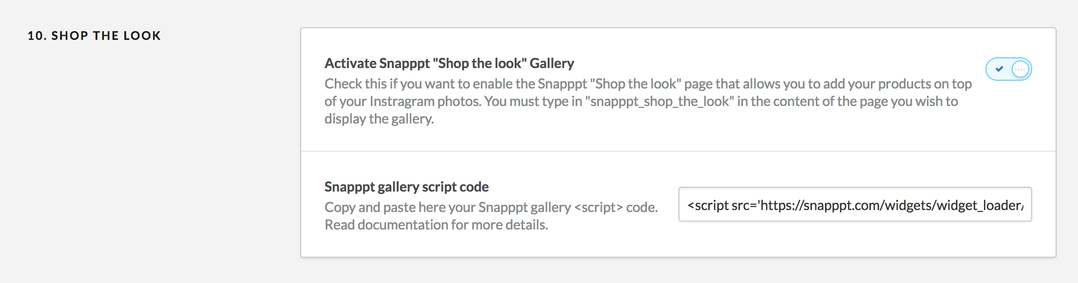
Lookbook/Shop the look#back to top
You can display a shop the look/lookbook instagram photo gallery using a third party service called Snapppt. Please not that the Shop the look features currently doesn't work in Internet Explorer 11. Snapppt is currently working on IE11 support.
- To get started, visit https://www.getsnapppt.com/ and create an account. You will need to connect this account to your instagram page.
Go to your instagram feed, and select a photo you would like to add to your home page. Fill in the options by adding your products on top of the photo. Repeat this for all the photos you wish to add to this gallery.
Once your gallery is ready, click on the menu icon and go to Shoppable galleries. Customize and create your lookbook grid by filling the form.
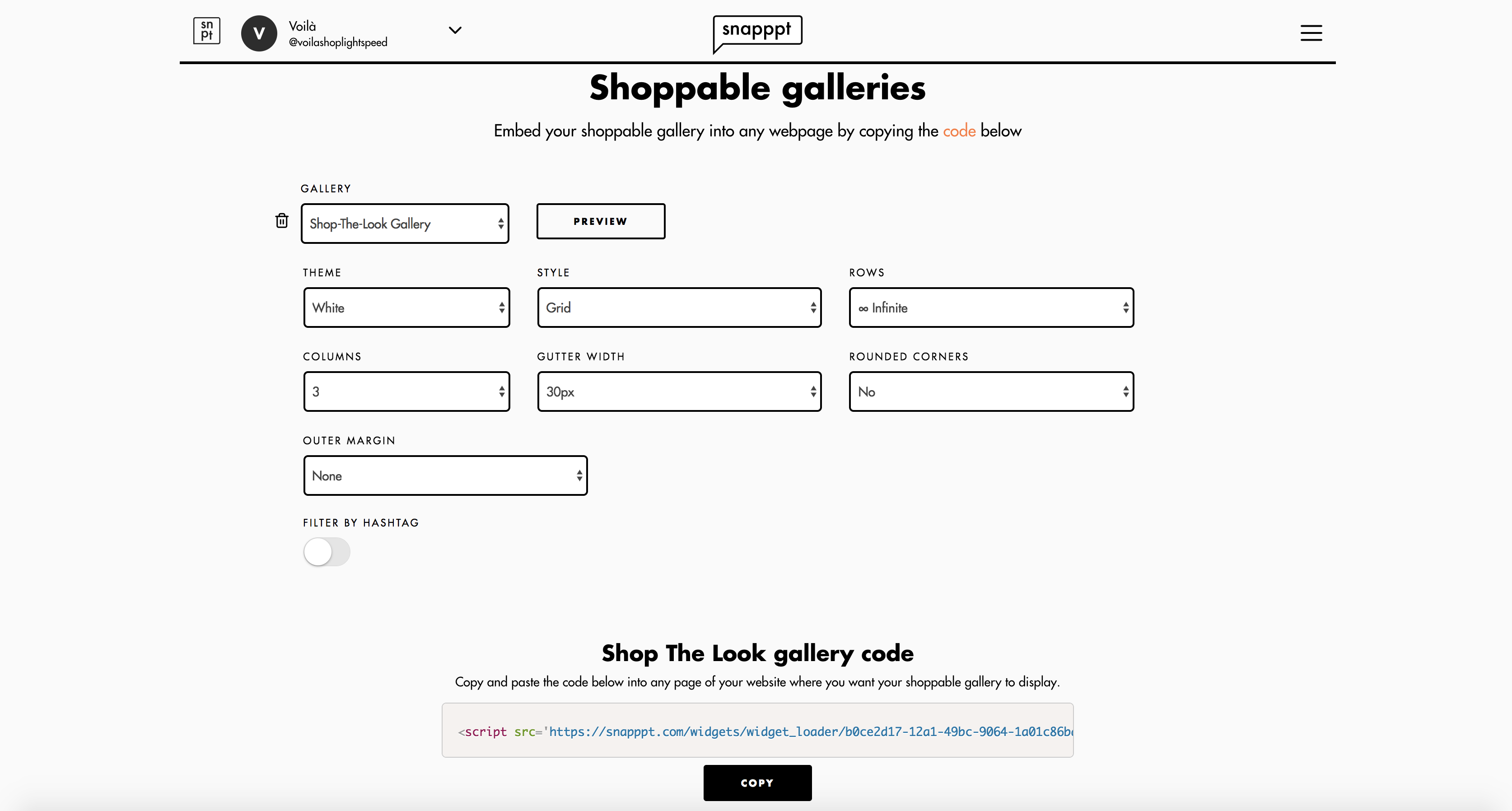
- Copy the Shop The Look gallery code at the bottom of this page and paste it in the "Snapppt gallery script code" input of your theme settings.
Copy the following text snippet and paste it into any page content. You can create a page by visiting backoffice > content > pages.
snapppt_shop_the_look
Facebook Pixel#back to top
If you would like to integrate a Facebook Pixel on your website, please enter your Facebook Pixel ID to activate it. You can find your Facebook Pixel ID in your Facebook Ad Manager account.
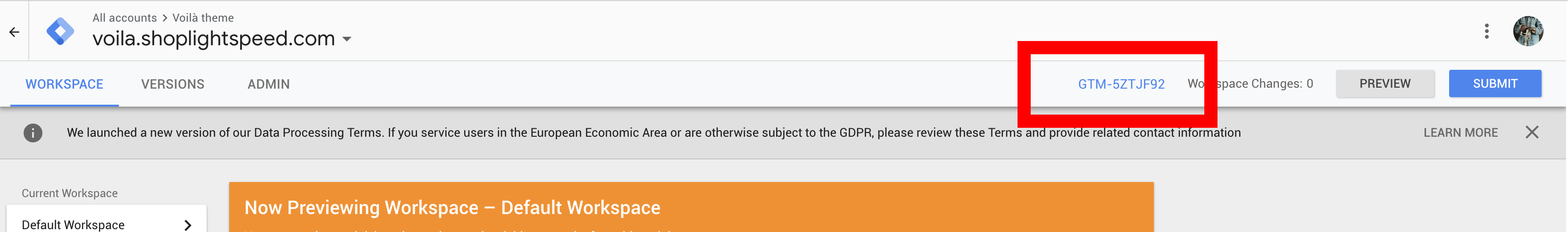
Google Tag manager#back to top
If you would like to integrate Google tag manager to your site, please enter your Google Tag Manager ID (GTM-XXXXX). You can find your Google Tag Manager ID in your GTM account.
Mailchimp integration #back to top
You can override the default Lightspeed newsletter signup form with a Mailchimp signup form by following the following steps. First of all, make sure you turn on the option “Enable Mailchimp”. Then you’ll need to find the Mailchimp form action URL for the list you want to subscribe your users to. Please make sure this list doesn’t have any required/mandatory fields other than the email field. To find your Mailchimp form action URL, follow these steps:
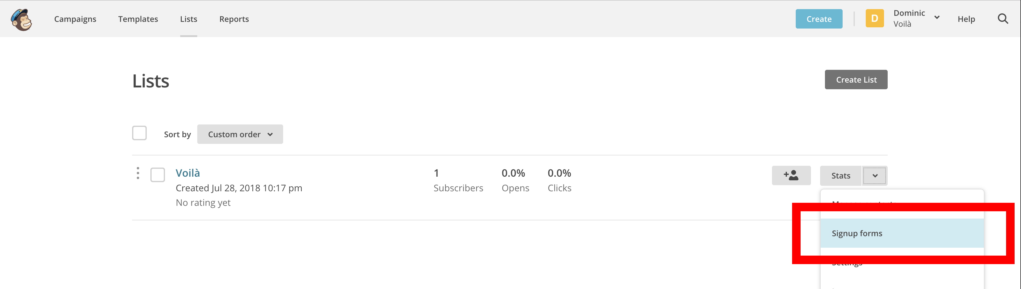
-
Go to your subscriber lists and click on the “Signup form” for this list
-
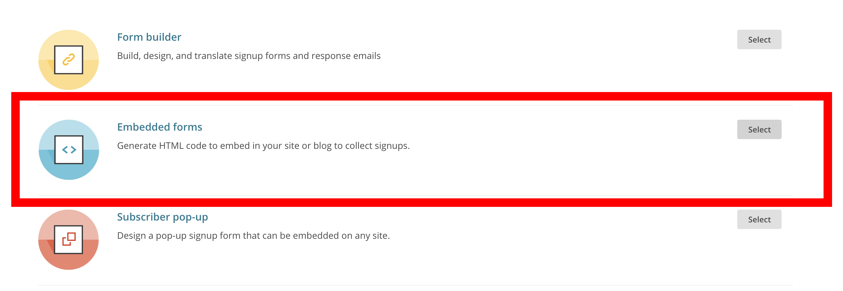
Click on “Embedded form”
-
In the Embedded form editor, click on “Show only required fields” to make sure the only field in the preview is the email field.
-
In the code section labled “Copy/paste onto your site”, copy ONLY the content of the form tag action attribute between the quotation marks (for example, copy the following part in bold:
<form action="https://webshopapp.us18.list-manage.com/subscribe/post?u=1b63807d43dfe6394c2551c99&id=35b213dfe65" method="post" id="mc-embedded-subscribe-form" name="mc-embedded-subscribe-form" class="validate" target="_blank" novalidate>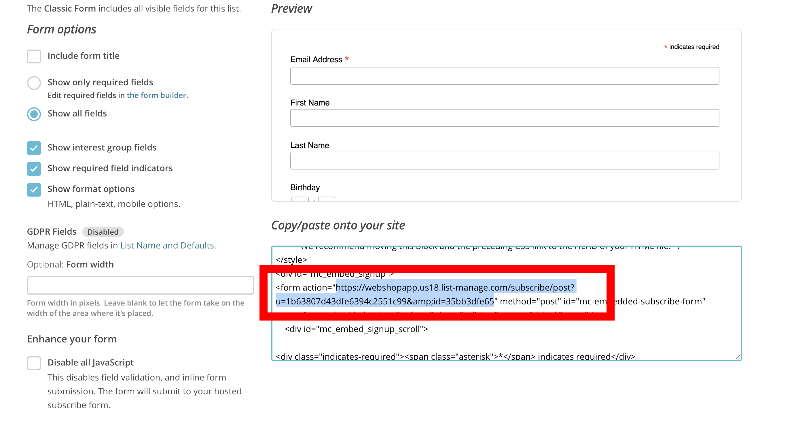
-
Paste the copied form action URL into the theme settings
Yotpo#back to top
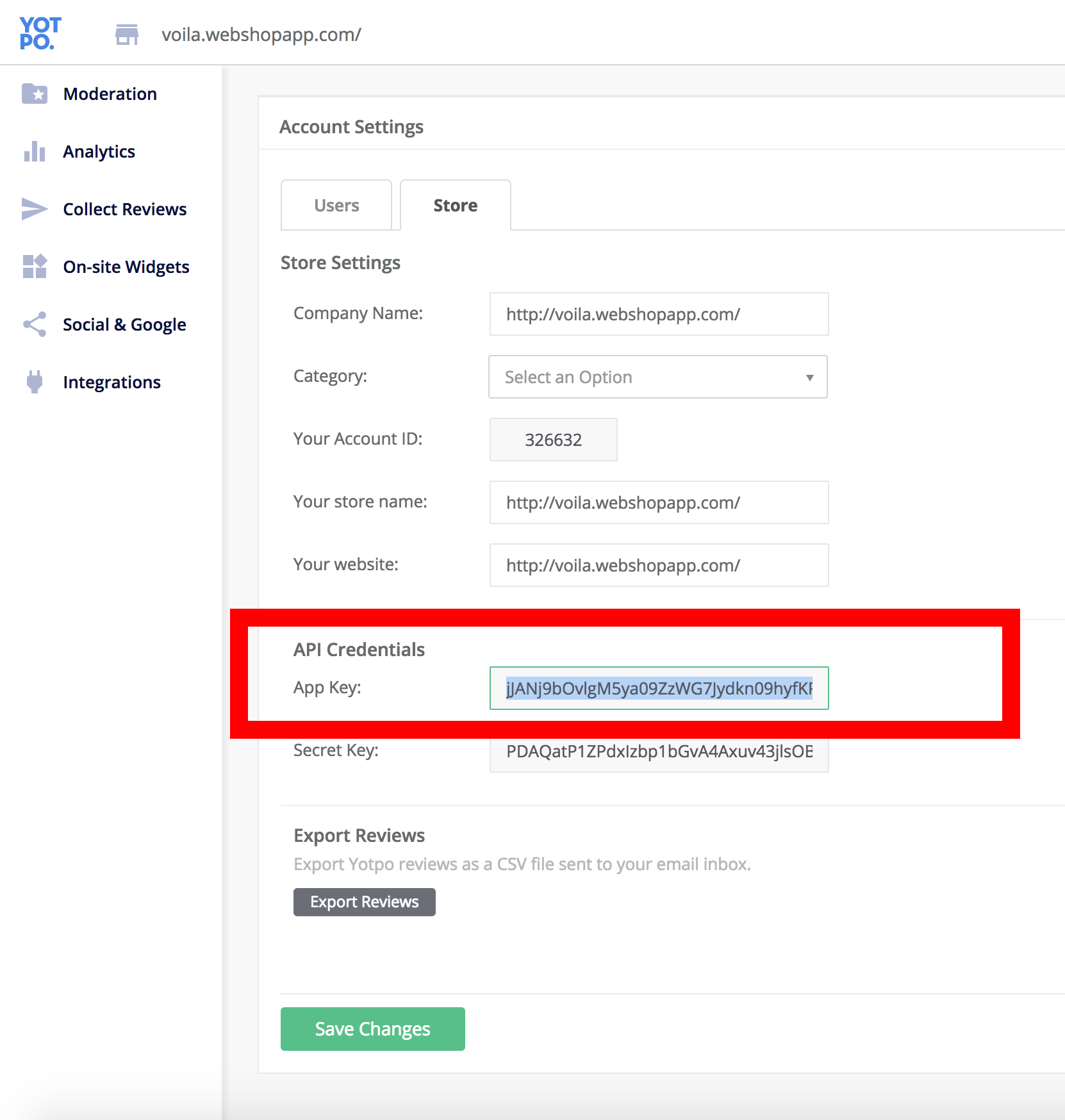
If you want to integrate Yotpo reviews to your online store, please enter your Yotpo App Key found under your Account settings > Store > API Credentials.
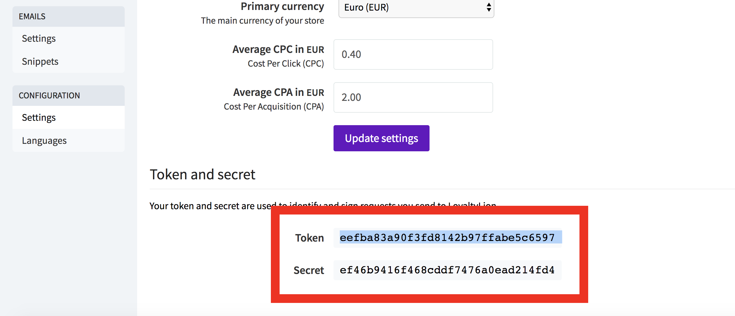
Loyalty Lion#back to top
You can enable Loyalty Lion on your website by typing in your Loyalty Lion token and Loyalty Lion secret that can be found in your account under Manage > Configuration > Settings > Token and secret. Copy both codes and paste them in your theme settings.
Translations#back to top
If your website is in a different language than English, or if you have a multilingual shop, you can translate your content by following the steps mentioned in this article.
Image dimensions/sizes#back to top
Here are some recommended images dimensions you might need (in pixels):
- Header CTA: 724x484
- Hero Background image: 3200x1328
- Big Banner: 2280x840
- Small Banners: 1110x640
- Home featured categories: 1600x1154
- Product images: minimum width 720
- Blog images: minimum width 970
- Newsletter popup image: 960x1048
Support Desk #back to top
Please remember you have purchased a very affordable theme and you have not paid for a full-time web design agency. Occasionally we will help with small tweaks, but these requests will be put on a lower priority due to their nature. Support is also 100% optional and we provide it for your connivence, so please be patient, polite and respectful.
Please ask question dominic@huysmans.me
Support for my items includes:- * Responding to questions or problems regarding the item and its features
- * Fixing bugs and reported issues
- * Providing updates to ensure compatibility with new software versions
- * Customization and installation services
- * Support for third party software and plug-ins
- * Make sure your question is a valid Theme Issue and not a customization request.
- * Make sure you have read through the documentation before asking support on how to accomplish a task.
Version History (Changelog) #back to top
Once again, thank you so much for purchasing this theme. As I said at the beginning, I'd be glad to help you if you have any questions relating to this theme. No guarantees, but I'll do my best to assist. If you have a more general question relating to basic Lightspeed eCom functionalities, you might consider visiting the forums or contacting the Lightspeed support.
Changelog
                                    -----------------------------------------------------------------------------------------
                                    Version 1.3 - January 10, 2010
                                    -----------------------------------------------------------------------------------------

                                    - Feature: Added a new Carousel gallery module to display images using the Lightspeed “Headlines”
                                    - Feature: Added option to display a new custom contact/customer service page template
                                    - Feature: Added live AJAX search in the header. You can preview results while staying on the page.
                                    - Feature: Added a top notification bar that can display a message
                                    - Feature: Added a custom 404 page to replace default redirection to home page (optional)
                                    - Feature: Added option to display a list of tag links above the blog
                                    - Feature: Added option to display price filter or not on collection pages
                                    - Feature: Added different position options for product sorting
                                    - Feature: Added option to display a button on hero banners instead of a link
                                    - Feature: Added new display options for the Brands page
                                    - Feature: Added option to add a social media sharing image for shared links
                                    - Feature: Added Pinterest verification code
                                    - Feature: Added Bing verification code
                                    - Feature: Added option to have a title in the Featured categories module
                                    - Feature: More display options for the Instagram module
                                    - Fix: When clicking on product reviews, automatic scroll to section and display reviews
                                    - Fix: Better rendering of the Mega menu columns
                                    - Fix: Moved categories filter of the collection page before the other filters
                                    - Fix: Removed asterisk (*) from the product variant selector since they are obviously required and there is always at least one option selected
                                    - Fix: Fixed a display glitch on the product filters when there was a lot of filters and not a lot of products
                                    - Fix: Improved logo responsiveness
                                    - Fix: Added better styling for FAQ section
                                    - Fix: A bug preventing to add Wishlist items when on SSL
                                    - Fix: Added “On backorder” label instead of the “Out of stock” label
                                    - Fix: Fix a bug where product images are in carousel mode + zoom enabled would zoom on the fist image
                                    - Fix: Added ability to translate validation messages for the Mailchimp forms
                                    - Fix: Fixed a bug where the products in the second tabs of the homepage product module would not display images until the window was scrolled.
                                    - Fix: Made sure the collection filters are in the right order
                                    - Fix: Video hero banner on iOS safari are now playing automatically
                                    - Fix: Multiple fixes and adjustments

                                    -----------------------------------------------------------------------------------------
                                    Version 1.2 - August 20, 2018
                                    -----------------------------------------------------------------------------------------

                                    - Feature: Added Mailchimp integration
                                    - Feature: Added Google Tag Manager integration
                                    - Feature: Added Facebook Pixel integration
                                    - Feature: Added Loyalty Lion integration
                                    - Feature: New Featured categories module layout options
                                    - Feature: New category catalog image cropping options
                                    - Feature: Added option to have padding between the cards of the Shop the look home page module
                                    - Feature: Added option to display the collection content at the top or bottom of the page
                                    - Feature: Added option to display the collection image at the top of the page
                                    - Fix: Fixed a bug where the megamenu would close with the big centered logo
                                    - Fix: Added missing language picker on mobile devices
                                    - Fix: Fix a bug where you could scroll right on iPad when product carousel were enabled.
                                    - Fix: Added some Open Graph meta tags for better sharing options
                                    - Fix: Multiple fixes and adjustments

                                    -----------------------------------------------------------------------------------------
                                    Version 1.1 - July 15, 2018
                                    -----------------------------------------------------------------------------------------

                                    - New preset: Voilà bike
                                    - Feature: New newsletter module for the homepage
                                    - Feature: Added youtube video support for products
                                    - Feature: Added Yotpo Reviews support
                                    - Feature: Option to add your store Google star rating for search results
                                    - Feature: New footer menu options
                                    - Feature: Added a dark mode option to make your dark background store look sharp!
                                    - Feature: New menu layout options to have the menu displayed below the logo (best when your menu is super long)
                                    - Fix: Show Header CTA on mobile view
                                    - Fix: Added store title in the header when no logo is set
                                    - Fix: Added styling to autofilled inputs created by some browsers
                                    - Fix: Changed footer menu social media text to icons
                                    - Fix: Moved catalog category title under the catalog image to make sure it is always readable regardless of the image
                                    - Fix: jQuery compatibility issue in the checkout causing issues when changing countries and some payment providers
                                    - Fix: Variant display issue for Omnichannel users
                                    - Fix: Multiple fixes and adjustments

                                    -----------------------------------------------------------------------------------------
                                    Version 1.0 - June 20, 2018
                                    -----------------------------------------------------------------------------------------

                                    - Initial release